Email best practices
5 tips for mobile-friendly newsletters

Email best practices

While the overall look and feel of email hasn’t changed much over the years, how users access and read their emails certainly has. Not too long ago, our inboxes were only accessible via dial-up modem from a stationary computer (remember AIM?). In contrast, users today receive and read emails from their smart devices on the fly.
Recent research demonstrates just how essential mobile-friendly, responsive emails are in today’s world, with 80% of users would delete an email that doesn’t display properly on their mobile device.
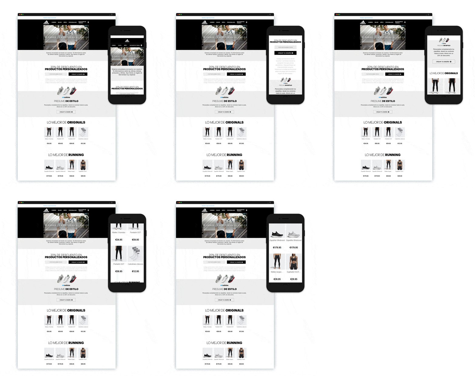
That’s where responsive emails come in, as they can adjust to different devices, screen sizes, and operating systems, so every recipient can read your message, whether on a laptop or an iPhone. But how does that work? Let’s take a closer look at how you can design more mobile-friendly newsletters.
If you want your customers to access your emails, you must provide them the flexibility to open emails on devices ranging from a laptop to an iPhone.
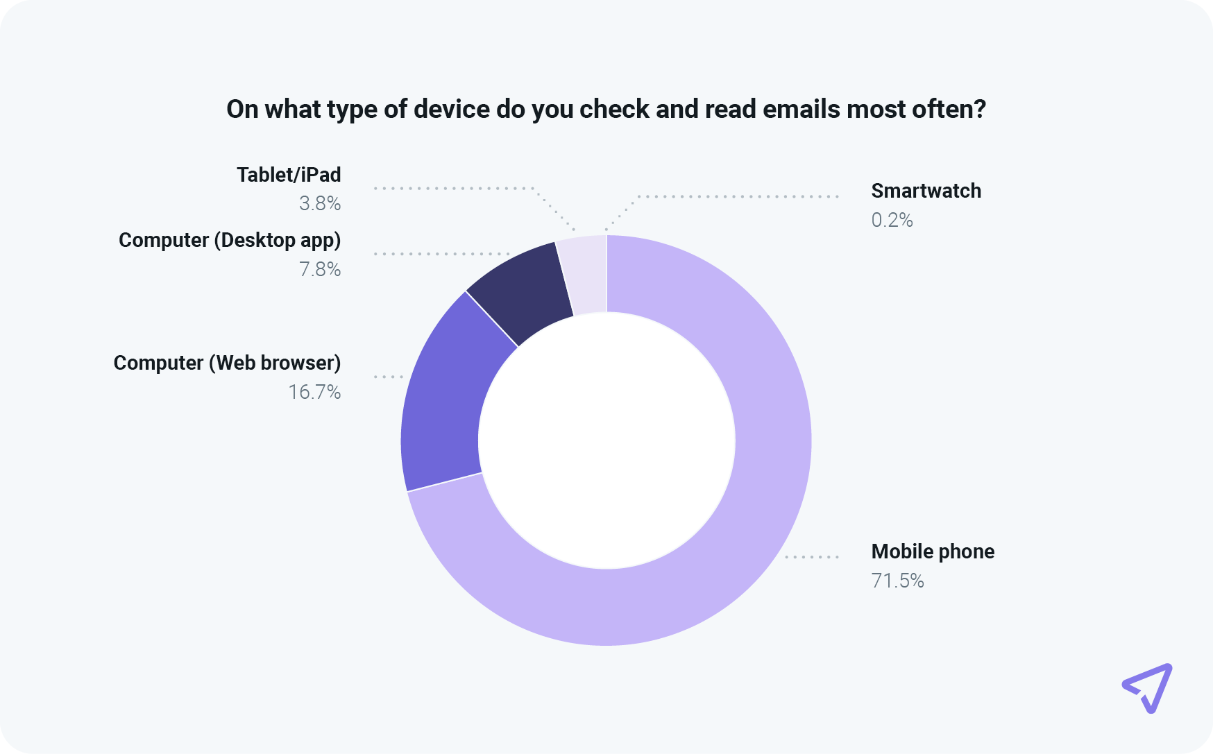
Our 2024 Sinch Mailjet engagement report shows that 71.5% of consumers most often check their email on a mobile device, and about 4% use a smartwatch or a tablet.

That’s why it’s crucial to think about mobile-friendly email marketing by creating responsive emails that can adjust to different devices, screen sizes, and operating systems.
To get you started, we have gathered a few of the most important steps to take in optimizing your campaign for a mobile audience.
With such compelling data showing the need for mobile optimization, you may wonder about the best ways to implement it in your email design. Well, we’ve done the legwork for you, gathering five vital tips on creating email newsletters that come to life on various devices, email clients, and operating systems.
An email’s subject line is the first thing users see when a new email lands in their inbox. Before even opening the email, a user might choose to delete it based on the subject line alone. Creating catchy and appealing headlines is crucial.
While this applies to every kind of email you send, it is even more critical when addressing mobile users. Reading emails off a smaller screen gives you less space for your headline. Additionally, readers will spend less time on each subject line since they will scan their inboxes on the go.
Once a user has opened your email, you want to ensure that your newsletter’s content is optimized for various screen sizes. The reason for this is quite evident – your message needs to get across to your readers, even on mobile screens. A solution for this is to keep your layout clear and straightforward.
Stick with a single column, so your emails don’t get too wide for mobile devices. Divide your text into smaller sections, and make it easy for readers to get an overview of the email’s content. This also applies to your call-to-action (CTA) elements.
Make sure that these are easily clickable and placed intuitively in the email to increase the chance of users interacting with them. Finally, avoid using overly large images, as they can slow down the email’s loading time for users and eat their mobile data to fetch your newsletter. Users always resonate with a responsive design.
Now that you have made sure your CTA is easy to find, it’s time to look at your outbound links. Also, remember that it’s not enough to get your readers to click on links. Ensure the page they land on also works on their mobile devices.
Ideally, the landing pages of your outbound links are already mobile-friendly, so the landing page automatically adapts its layout to match the visitor’s device. If you’re not using mobile landing pages, make sure you’re using a code that can be displayed on all types of devices, such as HTML5, as opposed to Flash.
After you have the fundamentals of your layout set, it’s essential to test the execution. This is especially important when optimizing emails for mobile devices with many sizes and screen resolutions. To understand how your design works, consider viewing your newsletter on several platforms.
This will allow you to quickly see how your layout elements are displayed on different screens and how clear your CTA is. Again, these are important to the performance and overall success of your email marketing campaign. An excellent testing tool is Email on Acid, which lets you preview your marketing emails on 90+ clients and devices, giving you peace of mind that all recipients see your message clearly.

A typical rule of thumb when designing marketing emails for desktops is a fixed width of 550–600 pixels, but mobile readers are significantly smaller, necessitating a different approach.
Apple devices automatically resize emails to conform to their screen size, unlike other devices, which is why it’s a good practice to design emails for either scenario. This allows subscribers to view your emails without scrolling left and right to read everything.
Email marketing is a valuable method for growing your business, so finding the right tools for the job is vital. Whether you have no experience with email design or are a seasoned email marketer, Mailjet has everything you need to create persuasive campaigns.
It all starts with our Email Editor tool and its intuitive interface, where you can drag and drop content, photographs, videos, and links without learning complex software. Every email you design in our has built-in responsiveness, giving you peace of mind that recipients can view your messages clearly on any device, operating systems, and the most relevant email clients. This will improve the user experience and ultimately, your open rate.
***
This is an updated version of the article “4 tips on optimizing your newsletters for mobile” published in 2017 by Nelly Moreau on the Mailjet blog.