Email best practices
How to design an email newsletter people will love to read

Email best practices

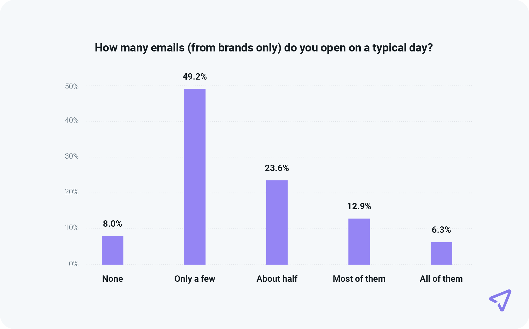
According to Mailjet’s Email Engagement 2024 report, 75.4% of consumers prefer email for promotions – up from 42% in 2021. Consumers also open only a few brand emails daily, with 49.2% engaging selectively. Your design must capture attention immediately.
So, what does this mean for email senders? Well, with inboxes more crowded than ever, great design is crucial in immediately capturing a reader’s attention. A well-designed newsletter determines whether your message is read, ignored, or deleted. Read on to learn the best practices for email newsletter designs to create anticipated, personal, and relevant experiences.
We know email marketers have a lot on their plate, so here’s a quick TL;DR – a comprehensive checklist to help you settle on the best email newsletter designs:
And for those with a little extra time on their hands, let’s explore some of these areas in greater detail.
Email newsletter design refers to the look and feel of an email when it lands in a recipient’s inbox. This includes things like colors, fonts, images, and how the content is arranged. A well-designed email newsletter makes it easy for people to read and understand the message; while grabbing their attention, so they don’t ignore or delete the email.
Today’s inboxes are cluttered – just look at the data; people that took our Path to email engagement survey gave us an estimate of how many emails they tend to receive. 73% of consumers told us they get more than 10 emails on a typical day. But many get way more than that. 37.7% believe they get over 20 emails per day. That’s probably not surprising to you. In fact, people may be underestimating their totals.
However, the challenge comes with this next finding: 49.2% of consumers say they only open a few emails from brands per day and 8% won’t open any at all.
And this is all before your newsletter is even opened. If an email is messy or hard to read, people might not even scroll below the fold.
A well-designed email makes sure the message is clear, looks professional, and encourages readers to take action – like clicking a link or making a purchase. For marketers and businesses, great design can mean more engagement and better results from every email sent.
Whether you use newsletter email templates or plan to create your own company newsletter, figuring out your web design language is no simple feat.
Figuring things out, like what colors and images to use, module placement, and whether or not to include links to multimedia content can be exhausting. Lucky you, though, because we’re here to help you get set up.
Setting a goal for your email newsletter is important because it helps you stay focused and measure success. Without a clear goal, you might send emails that don’t connect with your audience or drive results. Do you want to sell a product, share news, or get more people to visit your website?
Knowing your goal will help shape the design, feel, and content of your email newsletter. It also helps you track what’s working and what’s not, so you can keep improving them over time.
If you’re short on ideas, take a look at the competition and see what they’re doing. By subscribing to a few of their newsletters you’ll also better understand what you’re up against, and what that competitive space in a subscriber’s inbox looks like.
You might want to consider covering subjects like:
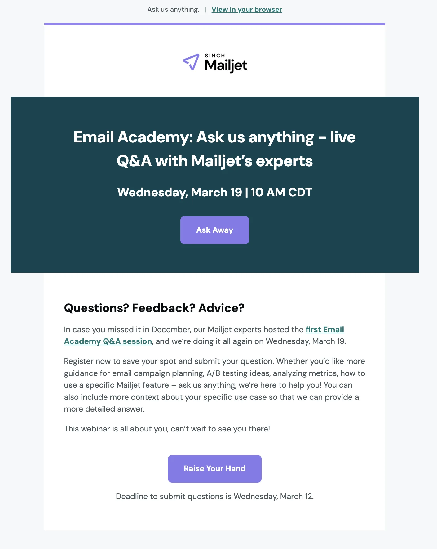
Mailjet uses its email newsletter to inform subscribers of any upcoming Email Academy webinars – it’s expert-led education series that provides email marketers with actionable insights they can implement immediately to their upcoming campaigns.
When designing the perfect email newsletter, the format is king. Set a width between 550-600 pixels.
Then place any desired focal points, like crucial information or a hero photo, squarely within the 300-500 pixel mark. This range captures the average size of the preview window for most desktop email clients.
While you can create emails in other widths, this can result in difficulties, such as making users scroll horizontally to see the entire message.
This ensures subscribers can see this focal point before opening the email.
Settling on a newsletter layout can be overwhelming because so many options exist.
Some quick layout tips:
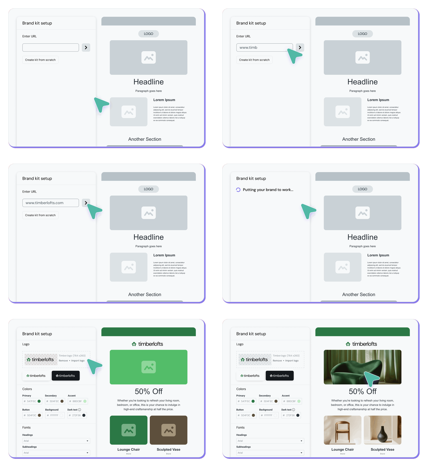
When you don’t have the resources to create your own template, you can head to Mailjet’s newsletter template gallery and tweak your favorite to suit your style. What’s more, you can now simpy copy and paste your brand’s URL directly into the template builder and it will apply your colors, logos, and fonts automatically.
Your email headers effect the first impression subscribers have of your newsletter, while the footers carry important information and opt-out options. Together, they tie the content of your newsletter together.
Your headings should project your brand’s identity and values. If you’re a beginner, don’t overcomplicate the process regarding newsletter design ideas.
Use a prominent color palette (more on this in a moment) and a contrasting one for the font and social links. And don’t forget your logo!
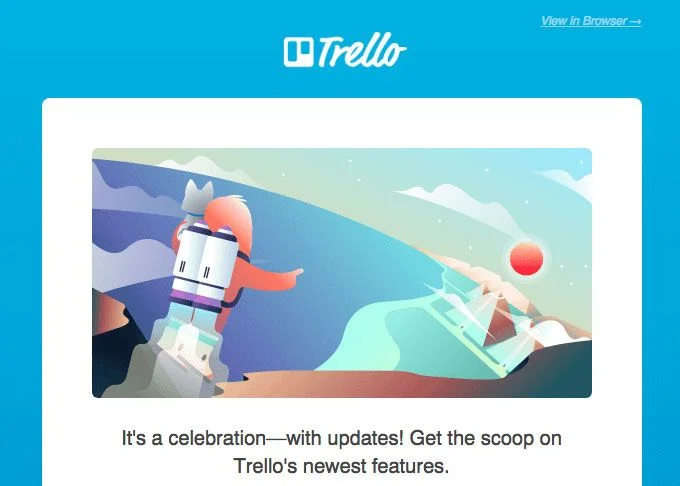
Trello’s simple and fun email header.
These round out the reader’s experience with your email newsletter’s design. Today’s reader gets inundated with email content and expects certain things from the content they interact with.
One such norm is that they can find brand contact information, social media links, and sometimes a street address in the footer of an email or digital newsletter.
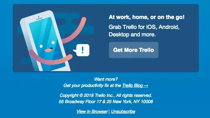
Contact information makes your email more legitimate.
You might be sending this newsletter as a way to gather product feedback. Or maybe you’re optimizing your newsletter to grow your customer base? Or perhaps it’s to spread the word about future live events?
Regardless of your reasoning, recipients expect to see a call-to-action (CTA) button to prompt them to do something. For example, if the goal of your newsletter is to drive signups, then you’ll want to include a link to a lead capture landing page where subscribers can leave their contact details.
You can then see the number of subscribers who clicked on that particular link and left their contact details on the landing page to effectively calculate the ROI (return on investment) of your newsletter campaign.
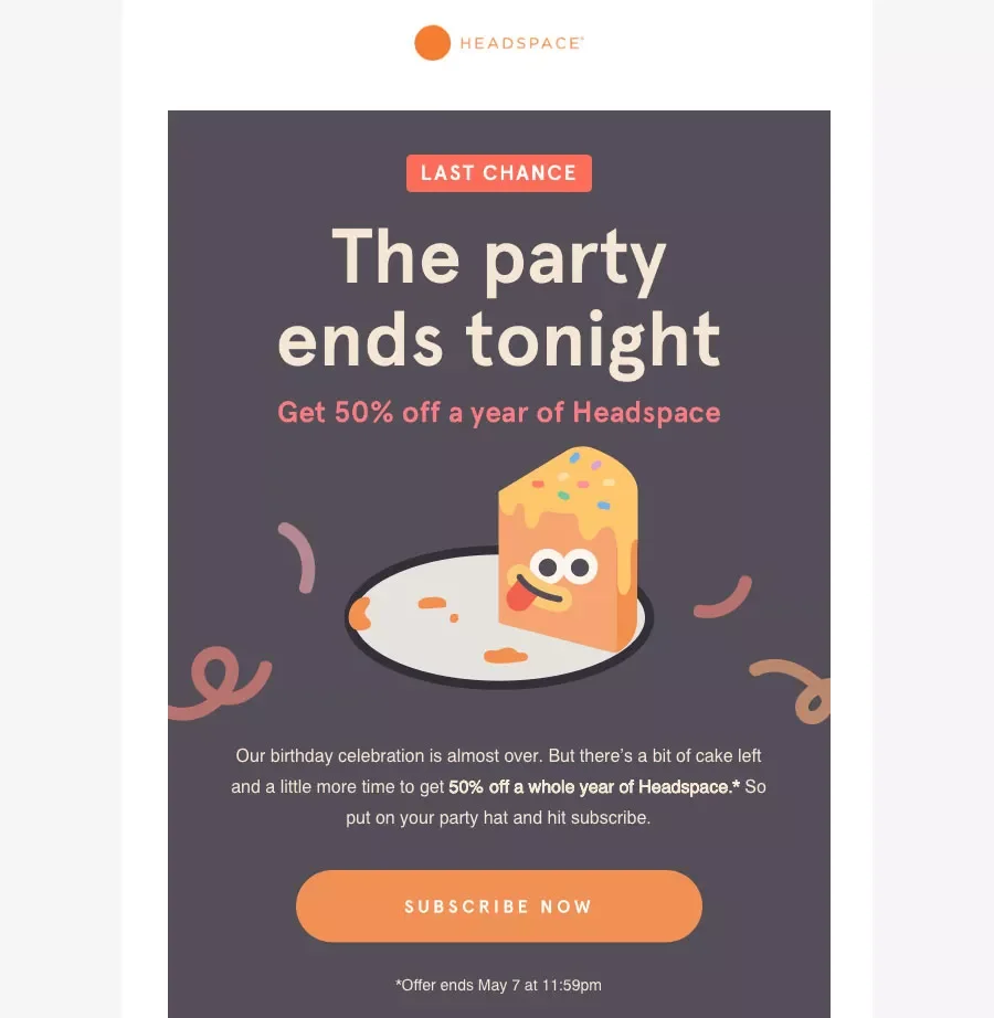
Keep your links to a minimum to keep your reader on track.
Creating a great email newsletter isn’t just about writing words and adding pictures – it’s about making sure your message is clear, easy to read, and looks good on any device. It should connect with your audience, keep them interested, and encourage them to take action. In this section, we’ll go over simple but powerful design tips to make sure your emails stand out in the inbox and get the results you want.
When putting an eye-catching newsletter template together, you should consider content first and foremost.
Keep the header and the rest of your content brief and concise, as you only have the reader’s attention for a short time.
Use images on top of your email to capture the reader’s attention, followed by short blocks of text and a clear call-to-action (CTA).
We recently talked about the saying: First impressions really do matter when it comes to the subject line. Well, when deciding if it’s worth their time to open an email, 78.7% of consumers say a discount or time-sensitive offer in the subject line is somewhat or very important.
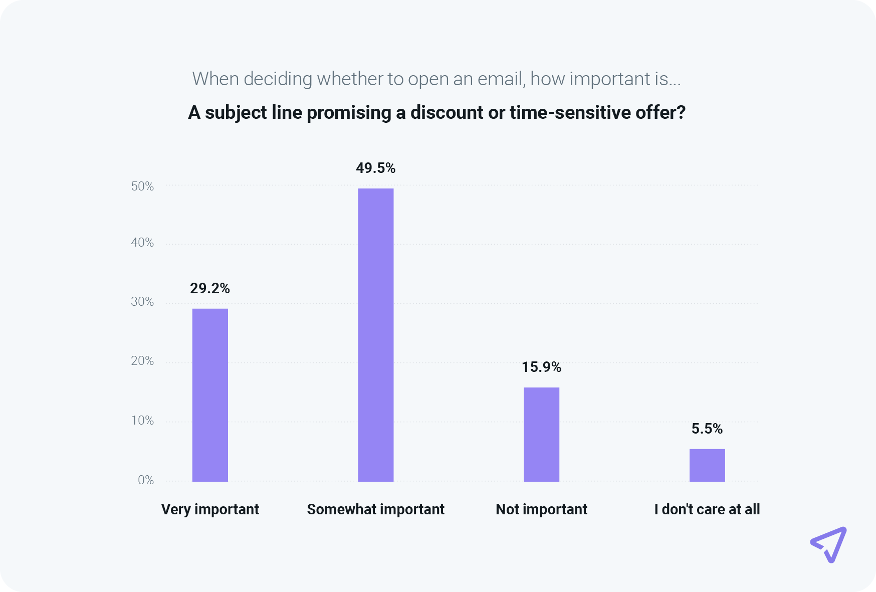
So if that’s the goal of your newsletter, make sure readers know about it!
Additionally, a combined 94.5% of survey respondents said recognizing the sender or brand name was either somewhat or very important when choosing whether to open an email. When consumers subscribe to your brand’s emails, it’s usually because they truly want to hear from you and learn more about what you offer. Your job is to deliver valuable, relevant email campaigns on a consistent basis.
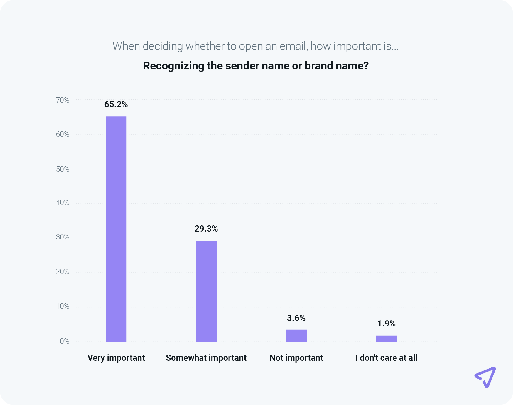
So, it might be a good idea to include a reference to your brand in the subject line, too. If your email is the vault and the content inside is the treasure, your subject line is the key.
Know your audience, personalize, and A/B test to find the best subject lines for your users that won’t make them want to unsubscribe.
To create the best email newsletter, give it a set structure: one feature area and two smaller columns below.
Don’t cram your email with too much information, as it won’t be appealing to the reader.
Provide plenty of white space and keep your newsletter neat and straightforward.
Try keeping a similar format to your newsletters, as users expect the same look and feel over time (hello, brand consistency!). To have your email render correctly on various devices, be mindful of your email size. The ideal width is between 500 and 680 pixels.
As we discovered in a previous post, different people respond uniquely to different colors.
Be mindful of which hues you choose for your images, background color, font, and CTA buttons.
After ensuring that you’re keeping true to your brand identity, think about your audience. Using specific colors based on your demographic, you can improve your results and, ultimately, your return-on-investment (ROI).
The more you know your customers, the better you can tailor your emails.
To gather information from your existing customers, try running surveys as part of a raffle or competition. You’ll find most users are willing to spend two minutes telling you about themselves for a chance to win something they want.
Imagine your CTA button is a sales assistant in a shop.
Are you likely to trust one that’s being pushy, asking you to try on a pair of shoes or buy a specific blouse? Or do you trust the informational, subtle, yet suggestive ones?
The same principle applies to newsletter designs.
Think about the placement of your CTA. Studies show that CTAs placed at the bottom of the email ramp up higher click rates than on the right or left of the email.
Also, make sure it has relevant text. For example, emails sent to a particular demographic may prefer “Purchase Now” to “Buy Now” Research, test, and compare your campaigns to improve your CTA.
Remember: timing is everything. You don’t want your subscribers to miss your stunning email newsletter design because you sent it at an inopportune time. Find the best time to send your newsletter to your readers for optimal engagement.
One newsletter template does not fit all. What your audience wants to see in their inbox varies greatly across brands and organizations. Here are some different templates to consider when designing your newsletter.
This is the perfect newsletter to send when you want to officially address anyone related to your business operations.
Whether that means your clients, investors, or staff, this kind of newsletter could be just the ticket to spread the good news, showcase what’s happening internally, announce new products, or address your company’s response to a significant world event.

Find this template in Mailjet’s template gallery.
These newsletters can be just what you need to engage with your investors and donors. They help describe what you accomplished thanks to their funding or what you plan to achieve if you’re requesting more support.
This type of content can be the perfect medium to share compelling stories and images about the communities or causes your nonprofit is involved in.

There are so many reasons your business might be organizing an event, and event newsletters are your way to spread the word.
In the 2020s, we’ve become accustomed to virtual events, but hybrid models are gaining popularity, and in-person events are making a comeback in 2025.
Keep your messaging organized to strategically send out newsletter reminders to increase attendance and engagement.
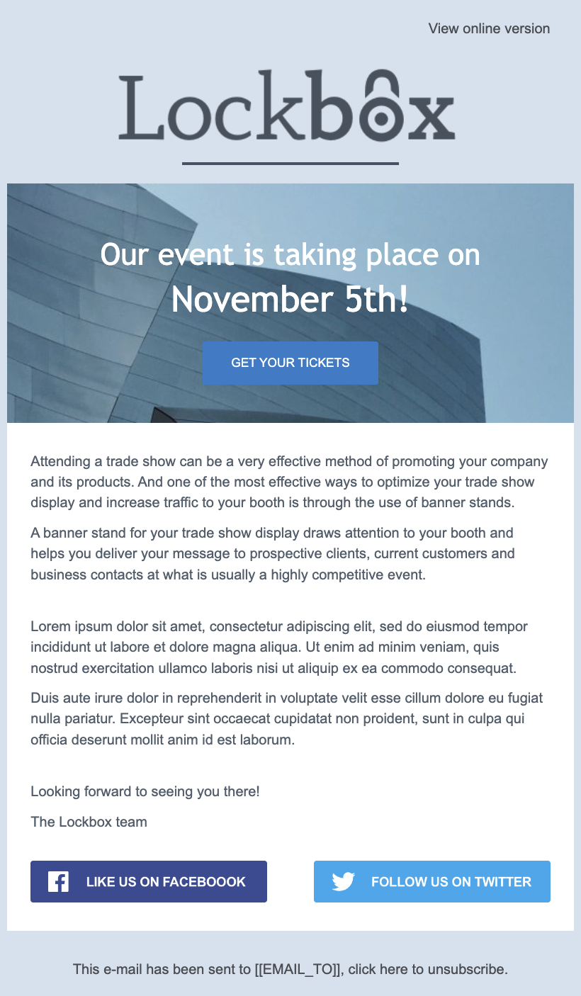
Find this template in Mailjet’s template gallery.
The holiday season is the best time to reach out to customers with spooky Halloween surprises, well wishes, and heartwarming stories from your company.
Holiday newsletters can also include special offers and deals or content recommendations to start the year off right.

Find this template in Mailjet’s template gallery.
This is a simple method to update consumers about everything from your most recent blog post to highlighting customer reviews and endorsements.
Talk about the perfect way to humble-brag.
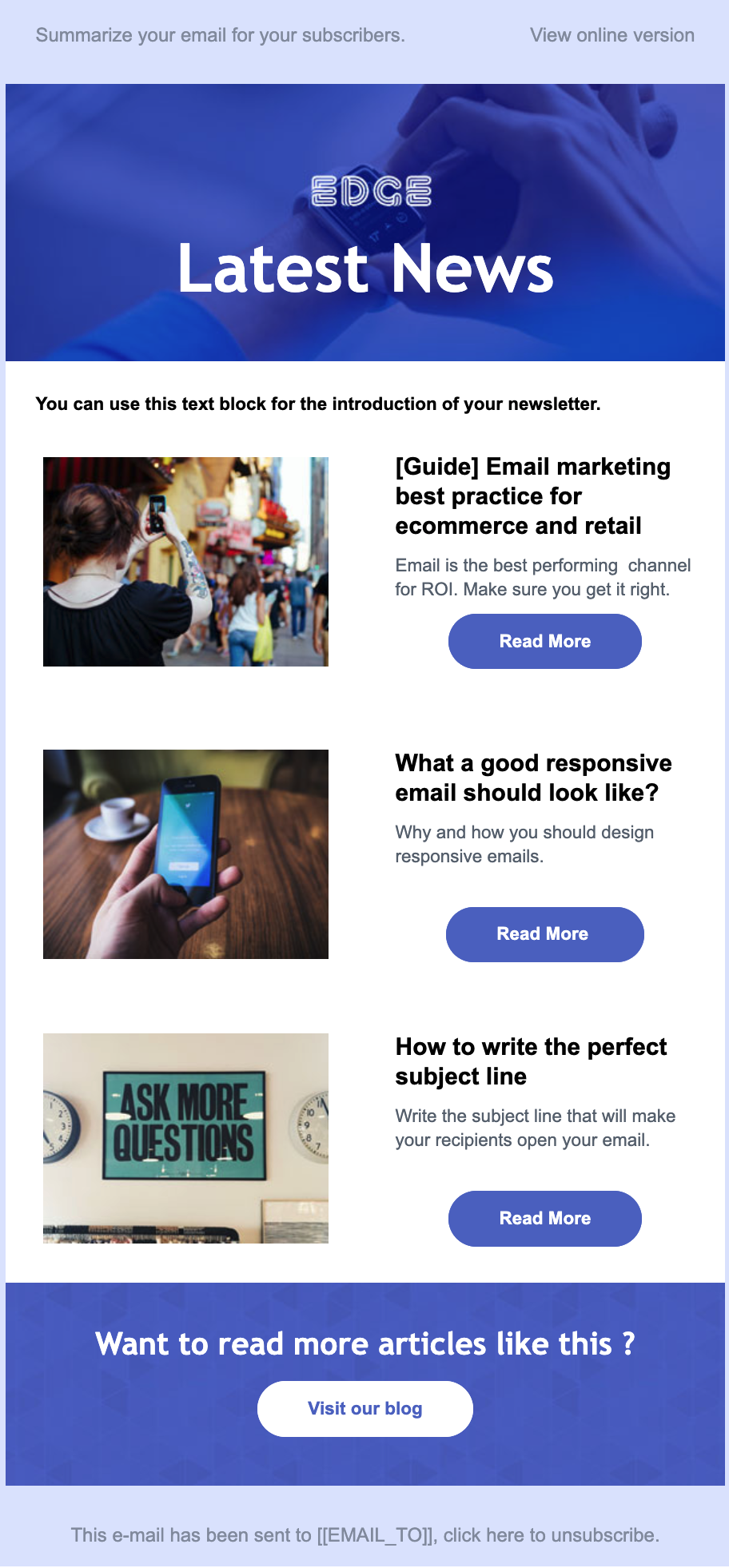
Find this template in Mailjet’s template gallery.
You can accomplish specific goals in the lifecycle of your business with newsletters.
Maintaining a consistent email newsletter schedule keeps your brand top-of-mind when a consumer is ready to take action, like sign up or make a purchase. A monthly newsletter sits in the sweet spot of showing up too much and not enough.
Let’s go over some examples of newsletter designs that are doing things right.
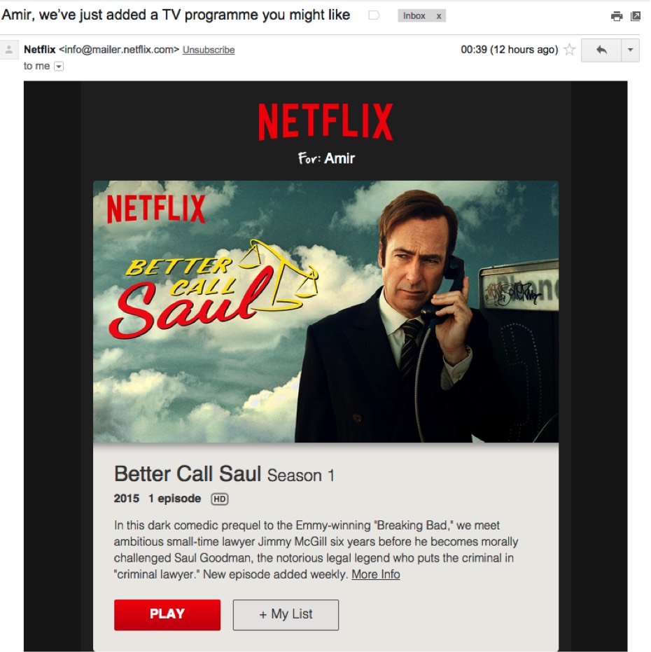
For us, this email design ticks all the boxes. It uses personalization in the subject line to get the reader to open it and uses a catchy image on top of the email to get the reader hooked.
The content is presumably based on this user’s most recently watched shows on Netflix and follows the same color scheme as the Netflix dashboard.
Finally, it has practical and not too pushy CTA buttons.
Hodinkee is the premier destination for all things wristwatches.
The single-column design looks clean across all devices, and each headline is short and sweet while avoiding overcomplicated jargon.
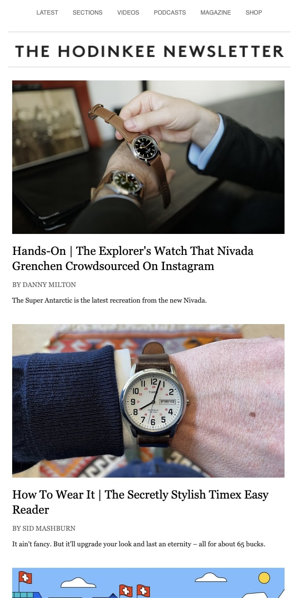
There is a wonderful juxtaposition among the imagery that you can see between those high-quality macro shots and the pop art vibe of the digital cartoon images.
It’s clear that Hodinkee has done their homework, and their newsletter feels like they’re holding the door open to step inside their world.
InVision’s newsletter puts forth their greatest hits from the week: stellar blog content and links, designs they enjoyed, and promotional opportunities.

Their newsletter is an excellent example of incorporating multiple dynamic components into your email marketing campaign.
We can’t help but salute the clever copy they write on their CTA buttons and the wide variety of headlines that definitely holds attention.
In a world supersaturated with business and tech newsletters, it’s no wonder that The Hustle reigns supreme.
They s쳮d because they’ve invested heavily into crafting their brand voice, which is the perfect intersection between fun and trustworthy.

The Hustle’s newsletter stands out because they’ve mastered audience segmentation.
By allowing subscribers to customize their interests, the team at The Hustle can cater their content to what those consumer groups care about.
Readers can look forward to receiving this newsletter every evening, and they subscribe so they can experience the top stories from the day.
Vox balances light content from across the internet with top world news, and audiences can always find something to pique their interest.
They also make it easy to read the whole story on their website through the hyperlinks they put in their content.

When it comes to designing an email marketing email newsletter, these are some of the typical mistakes begginers make:
Responsive design is a technique that automatically adjusts how an email is displayed in any email client. Designing an email using responsive design is essential, given that most users nowadays read their emails on mobile phones. In fact, 80% of email recipients suggested they would delete an email that didn’t display correctly on a mobile.
Therefore, when designing your emails, make sure you use an email editor that uses responsive design by default, such as Email Editor from Sinch Mailjet. To take it one step further, Email Editor even offers a preview feature to help you check how your email is shown in different inboxes, for multiple device makers, versions, devices and countries. No more guessing….
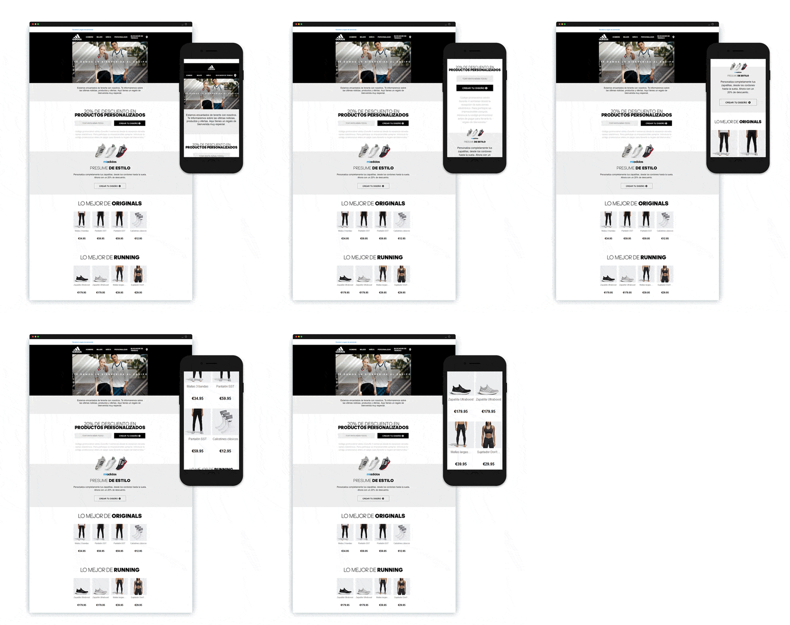
An example of a responsive email design that scales and adapts to a reader’s mobile screen
Stick to a single-column style so your content is easy to read on a standard mobile phone.
Also, you’ll want to design your email newsletter by leading with the most essential information.
People spend an average of 10 seconds reading branded emails, so yours needs to be legible and compelling enough to hold your audience’s attention right from the start.
An email recipient can be critical and skeptical of everything that enters their inbox. As such, you’ll want to consider readers who are only going to quickly scan your email rather than read your entire newsletter thoroughly.
To anticipate this, write your content using short, digestible sentences, and avoid lengthy paragraphs.
Think about it: different people have different tastes, and it’s rare for content to be universally beloved.
So, with that in mind you should consider segmenting your subsrcibers by interests, location, age, product preferences, gender, lifestyle, past purchases, average spending, or purchase frequency. You can also combine these elements to target specific groups, like women who buy motorcycles every month.
Using an email marketing strategy like surveys, you can encourage your audience to self-identify. After they do, you will have more data to create engaging email content that better serves them or targets their interests.
Designing the perfect email newsletter is a well-rewarded practice. We’ve given you the tools, suggestions, and examples you need to help you get started. If you’re looking for more, check out our step-by-step guide on how to create an email newsletter.
Or if iyou think you’re good to go, we invite you to design a branded email newsletter using Mailjet’s Email Editor. Take everything we’ve taught you in this article, throw it into a template, and you’re good to go!
An email newsletter is a fantastic tool that tells current and potential clients about anything going on with your brand or business. Maybe you’ve got an exciting event approaching, or you’re launching new products. Or perhaps you have a promotion, sale, or accomplishment worth sharing. Your newsletter can be the mouthpiece you need to spread the word.
Sure, it’s a common understanding that social media does wonders for today’s advertising and marketing efforts. However, the numbers don’t lie; they show that consumers spend 46.7% more time reading email newsletters than on social media platforms like Facebook. Plus, the time users spend on social media is passive. Even if individuals see your marketing campaigns on Facebook, they may not internalize your brand message or click through to your website.
Most email newsletters should be around 600-800 pixels wide to ensure they display correctly across different email clients and devices. This keeps your content easy to read and prevents scrolling issues on smaller screens.
Use responsive design so your email adjusts to different screen sizes. Stick to single-column layouts, large fonts (at least 16px), and tap-friendly buttons (at least 44×44 pixels) to make navigation easy on mobile devices.
A good rule of thumb is a balance of 60% text and 40% images. Too many images can slow down load times or get blocked by email providers, so always add alt text to describe your images in case they don’t display.
Keep your newsletter short and scannable—aim for 200-500 words with clear headings and bullet points. If you have more content to share, use buttons or links to direct readers to your website or blog.
Use strong subject lines, personalize your emails (like adding the recipient’s name), and include a clear call-to-action (CTA). Also, test different layouts, colors, and button placements to see what works best for your audience.