Email best practices
How to write a good newsletter
Email best practices

With today’s overflowing inboxes, crafting a newsletter that cuts through the noise can feel like a challenge. Heck, sometimes it’s a small win in just getting the thing opened!
But fear not, email marketers. In this post, we’ll delve into the key components behind writing a good newsletter, analyzing techniques for creating engaging content, designing an appealing layout, and ensuring your newsletter reaches and resonates with your target audience.
The Oxford English Dictionary defines newsletters as “bulletins issued periodically to the members of a society or other organization.” It sounds pretty 19th century, but you get the gist.
A more modern take on the definition would be “newsletters are emails that businesses send to their subscribers to let them know what’s going on in their company,” whether it’s about their product, upcoming events, or information about the business itself.
Creating a newsletter probably won’t be as short, sweet, and straightforward as the definition is. It will take some time to write, to carefully plan, and will likely evolve over time. But all great things take time, right?
Fortunately, we’re going to make it a little bit easier by giving you some pointers about what makes a good newsletter, and then look at some examples to spark ideas for your own newsletters. So, without further ado – let’s get into it.
Open up one of the newsletters in your inbox. You can probably pick out a couple of things that you really like about it. Maybe the images are unique and eye-catching, or you see your name in the subject line, making you want to read more. With all the possible directions you can take your newsletters, there are some best practices you’ll want to keep in mind.
What’s a good newsletter without…news? Remember, we don’t just want our subscribers to open our emails, we want them to find value in it and click through to our website. But hold the phone; that’s only possible if we have new content written regularly.
If you’re a small business, then team members can contribute blog pieces to be featured in the newsletter. Business owners also make for great contributors since they are authorities within their field and often have good stories to tell. You can also look outside your organization and curate great content from guest contributors.
Content can come in the form of company news, infographics, product launches, tutorials, and free resources. The possibilities are endless: you can pluck ideas out of your existing digital marketing strategy, marketing campaigns, company milestones, or pull in an excerpt from your blog piece into your newsletter, something known as “email blogging.”
So, when it comes to brainstorming your next newsletter, the email content should be there, ready to go. Leaving you more time to focus on creating eye-catching subject lines and sculpting beautiful newsletter designs.
Ok, ok, we know – this one seems pretty obvious. But before you skip this section, we want you to realize there’s a lot more that goes into this concept than you might think. Of course, you’ll want to include recognizable branding like your logo and some images for your social media avatars.
You want subscribers to recognize your emails because, well, they signed up for them, so they clearly want to get them! Side note: don’t go overboard with the branding. Not every inch of the email needs to be branded, just enough to make it recognizable.
Your branding extends beyond the physical appearance of your emails to the address you’re actually sending from. Sending from an address like “no-reply@” or “do-not-respond@” might come off as a little cold to your subscribers.
Instead, sending from an address that has, for example, the name of someone on the email team in your company is a lot friendlier. If your weekly newsletter is the main point of contact your customers have with you, having a friendly sending address is a great way to set a good first impression as they learn more about your brand.
Bonus points are awarded if the email address accepts replies. It’s a good boost to your sender reputation, as well as fostering goodwill with your subscribers and giving a couple of brownie points to your brand reputation.
This applies to…well, pretty much every aspect of your email newsletters. But let’s start with the best time to send your newsletters.
While there are a couple of different things to consider while deciding when to send, whatever day and time you pick, it’s best to keep it on a schedule. It helps you plan out your marketing efforts, and you can test out the best time to send them to get the most opens and clicks. Once you find that sweet spot, why send at any other time?
While we’re on the subject of timing, keep in mind the frequency of your emails as well. I’m sure you don’t like opening up your inbox and seeing five emails from the same company, so you don’t want to do that to your own subscribers. Depending on your business, it’s probably best to stick to one or two emails a week, nicely spaced out.
Keeping with the theme of consistency, the layout of your email should get the same treatment. It may be hard to settle on a design, and the occasional shake-up may be called for, but for the most part, it should be recognizable to your subscribers. Changing it up often might cause confusion, and it’s a lot of additional work on your part.
The layout of your email design contains all the small details that make it yours. Fonts, images, and colors should all carry a level of consistency with them. Looked at individually, they may seem like such small details, but they all come together to create your newsletter (and we know you want to see your creativity and hard work s쳮d).
No one likes to get a cluttered email. Too much text, out of place images, and a layout that doesn’t guide you through the information is just not something that your customers are going to spend time reading. And for you, an email with no clear direction will result in fewer clicks and fewer conversions.
Opting for a simpler design, one that contains the necessary amount of text and images is the better way to go. Creating an email where the reader has to scroll forever to get to the bottom might make important content go unnoticed, especially if it’s tucked at the end.
A simple email with less to distract your readers will make your calls-to-actions (CTAs) stand out so much more. You can lead your readers to better interact with your emails, and hopefully boost your clicks and conversions. We know you have a lot of interesting information to tell your subscribers, but being selective about what you share can help focus your emails.
The simplicity of Aldo’s newsletter is something to aspire to. Right off the bat, you open the email and immediately know what it’s about. That picture, front and center, tempts you with a new pair of shoes right away. And why not make them “Cassedy”? They definitely have a color you’ll love – just look at that photo.

The image already lets us know what this newsletter installment is all about, so the copy can be short and sweet. And clever, too. Lastly, check out the 40 percent off Aldo gives us near the bottom, with CTAs to take advantage of it.
We mentioned it above, and we’ll mention it again. While there are definitely exceptions to the rule, simplicity is the best way to lead your subscribers to your CTA. Keeping text to a minimum, while still managing to convey your message, is a skill that can take a while to master. But it is so effective that it’s worth the effort.
A big tip for keeping an email simple is to make it skimmable. With your newsletters, it would be great if your subscribers read every word, but if we’re being honest, they probably aren’t. To help them out, we have a couple of tips to make your emails skimmable:
What’s the best thing you can do to make an email skimmable? Make the text big and make it stand out from the rest of the email! Think to yourself, “what do I want the main takeaway from my newsletter to be?” and then make it rise above the noise.
The structure of your newsletter plays a large role in how skimmable and scannable it will be. Sectioning off the email into smaller, digestible chunks can make it visually clear where the most important information is, and where their eyes should go. For GameStop, they section off the email with simple but complementary images, and each section has CTAs that relate to the sections.

Gamestop uses a perfect balance between image and text. The images are large, and the text is just as big to match. It takes around 20 seconds to get all the way through this newsletter and even less time to understand what it’s all about. The CTAs throughout make it easy for you to follow through. I mean, who doesn’t want more video games?
A GIF is a great newsletter idea because it is a striking way to highlight a visual feature of your product. While videos can’t be used directly in an email, they can easily be converted into a GIF and used with stunning results.
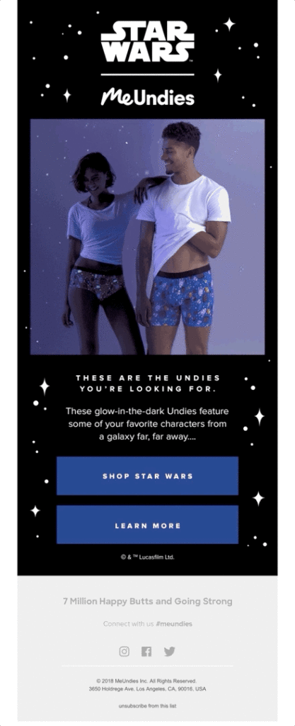
This email by MeUndies makes even the least geeky person want these Star Wars themed underwear. Right after you open the email, you know what they’re offering you, and at the same time, you definitely want it. Come on, look how cool that GIF is!
Moving further down, the copy is short and sweet, making use of not one, but two of the most famous movie lines in history to carry on the Star Wars theme. The CTAs are large and will take you exactly where you want to go after being mesmerized by that GIF. When taken all together, there is very little to distract from the goal of this newsletter: MeUndies has some awesome new merchandise for you, and you’re going to want it.
The goal of your newsletters is to get conversions, whatever that may mean for your company. Maybe you want purchases, downloads, subscriptions, or simply to spend time on your site. But the best way to do that is not to bombard them with offers and CTAs, but rather make your newsletter informative and chock-full of useful information that will keep customers opening your emails week after week.
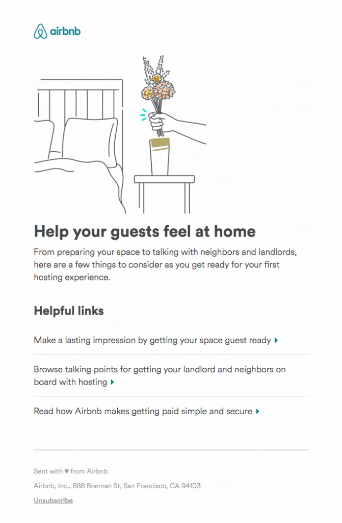
Look at this example from Airbnb. You might’ve downloaded the app a while ago, it’s sitting on your phone in some folder on the third page of your apps, and you have a trip home planned in a month. Suddenly, you get this email in your inbox, and it reminds you of the opportunity in front of you to rent out your place while you’re on vacation.
Airbnb’s newsletter is subtle – it doesn’t beg you to open the app and post your property for rent. Instead, it offers you helpful tips and tricks to guide you through the process.
The CTAs are very different in this example because this newsletter is angling to add value to their email, rather than just be another one cluttering up the inbox. They’re informing rather than just selling.
Almost overnight, dark mode has become the hottest new design trend. When the sun goes down, many phones and computers switch to a dark background to give eyes a rest. While 44% of marketers have begun implementing it, dark mode still comes with its challenges. So tread carefully.

Take a second to really look at this newsletter from CleanMyMac. What is there to dislike? The coloring of the email is intriguing, with the icons bright against the dark background. It brings about vibes of developing, coding, or advanced technology, which fits right in with the branding of CleanMyMac. Unlike many other newsletters that clutter your inbox, this one gets right to the point and gives you the information you need with the option to have more.
This newsletter is more than just pretty, it’s also informative. The whole purpose of this email is to inform subscribers of some new updates to the program, but in doing so, it could pull them back to the website. Using your newsletter to update your customers can create renewed interest in your product.
The second thing to check out is the placement of CleanMyMac’s CTAs. One is right before the list of updates, and the other one is right after. Ingenious. You might be wondering why, and the answer is because the CTAs have the same goal, but they live in different parts of the email journey. Some subscribers might read the whole email, top to bottom, and for those subscribers, there’s a CTA at the bottom for them to learn more. For the slightly busier (or maybe lazier) subscribers, there’s a CTA for them right at the top, so they don’t have to waste any time.
If a picture is worth a thousand words, then how many words is a video worth? If you have the resources to supplement your information with great graphics and videos, go for it. But take a page out of MacPaw’s book, and make sure you don’t overwhelm your readers.

If a picture is worth a thousand words, then how many words is a video worth? MacPaw does a great job of including images and interactives within their newsletters, making it hard to leave the email itself. The reason it doesn’t feel overwhelming is because of the layout. MacPaw doesn’t shove it in your face all at once, but rather lets you scroll through sectioned-off pieces of content. This allows you to pick and choose what to spend your time on.
You will also want to keep in mind the responsiveness of your email. This means how well it appears on each screen the email will be viewed on, and which inbox it’s opened in. With 15% of consumers unsubscribing from poor mobile optimization, the responsiveness of text, layout, and interactives should be a top priority.
I’m sure at this point, you’re tired of hearing about social media. It’s everywhere, and everyone and their mother tells you that you need to have a social media presence. One way to make it a little easier for you is to let your subscribers do some of the work for you.

Take a look at this example from National Geographic. Its “History” newsletter keeps it simple. There’s not much to clutter the email, and text is kept purposeful and to a minimum. The point of the newsletter is to highlight the most interesting stories of the week and condense it into a newsletter that’s easy to read.
There is one really good newsletter idea that might not immediately jump out at you. Can you spot it? They’re tiny, numerous, and imperatively important. They’re the social media sharing buttons. However, in this newsletter, it’s not just that they exist, but that they are placed after each article. It makes it easy for you to single out your favorite breakdown and share it with the world. You get to start a conversation online, and National Geographic gets more exposure with very little effort on both sides.
Adding social sharing buttons in each of your newsletters can get you some great exposure. Whether it’s sharing your latest post, product, or image – make sure to tuck in some social buttons. You don’t just have to stop at sharing on social media, either. Adding an option to share the whole email is also a great way to get your newsletter in front of more eyes.
As you can see, writing an engaging newsletter is about utilizing a blend of art and strategy, backed up by thoughtful content and a deep understanding of your audience. By focusing on delivering value and incorporating engaging elements to your newsletter, it can become a powerful tool for building relationships and driving engagement.
If you’re looking to for an easy-to-use platform that blends all these stylistic elements into a single newsletter, take a look at Sinch Mailjet’s Email Editor. You can choose from a set of pre-designed email templates or design your own, using a flexible drag-and-drop features to easily add content, photographs, videos, links, and GIFs.