Email best practices
Landing page optimization best practices, tips, and tools to boost conversion rates

Email best practices

So, you have slaved away for weeks on your campaign. You’ve built a list of targeted keywords, written pay-per-click (PPC) ad copy, adjusted bid amounts, carefully crafted your email copy and design to synchronize perfectly with the overall look and feel of your landing page. It’s finally time to push the go button.
The first visitor arrives to your landing page and, rather unceremoniously, leaves. The second does the same. The third at least clicks on a link but soon, too, joins the others and eventually leaves. As more and more visitors stop by, only a handful take the desired action you’d hoped for.
What’s wrong? Why is nobody engaging with your landing page? Are you doomed to suffer from low landing page conversion rates for the rest of your marketing career? Luckily for you, the answer is no. While this guide is no silver bullet for all your marketing woes, it will teach you how to optimize your landing pages for optimum results.
First off, let’s start by defining what a landing page actually is. A landing page is a specially designed web page that serves as the entry point – typically to a website or sub-section of a website. Unlike your homepage, which might have a broad range of information and links to various parts of your site, a landing page is created with a single focus or goal in mind.
Think of them as the digital equivalent of a well-crafted flyer handed out to passersby. They’re meant to grab your attention and get you to take one specific action—whether that’s signing up for a newsletter, downloading an e-book, registering for a webinar, or making a purchase.
Unlike typical webpages, landing pages direct visitors to a specific action without any other distractions. For example, if you’re promoting an email marketing software, you might create a landing page offering a free trial. The page would detail the benefits of your software, include testimonials, and prominently feature a CTA button for visitors to sign up for the trial. This targeted approach helps convert more visitors into leads or customers compared to a general page on your website.
In essence, landing pages are all about clarity, focus, and effectiveness in driving specific actions that support your business goals.
Now, there are several different types of landing pages. We’ll run through some of the most common you’ll likely be optimizing below:
|
Landing page type |
Description |
|---|---|
|
Lead capture landing page |
The primary goal of a lead capture page is – as you’d expect from the title – is to convert potential customers, into leads. |
|
Squeeze page |
While similar to a lead capture page in terms of its goal, a squeeze page is more minimalist in its design, worrying less about educating visitors and more about getting them to sign up. |
|
Click-through landing page |
A click-through landing page is a type of landing page designed to direct visitors to another page via a CTA button, often leading to the actual conversion like a purchase or signup. |
|
Pricing page |
The pricing plan page is an area of your site for visitors to compare plans and identify the one that best suits their needs. |
|
Long-form sales landing page |
Sometimes a simple squeeze page won’t do, so a more detailed landing page that painstakingly answers all your customers pain points is needed. |
|
Event registration page |
Whether you’re hosting a webinar series, speaking at a conference, or organizing an in-person meet-up, you’re going to need to let people know about it |
|
Product page |
A product page serves as a kind of digital storefront for a specific offering – whether it’s a physical product, software, or service. |
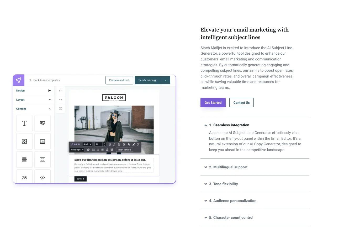
Here’s an example of a Sinch Mailjet product page outlining the benefits of its fully-integrated AI Copy Generator.
While we might not be able to ever say for sure why a particular visitor did or did not convert on our landing pages (unless of course we are able to directly ask them) there are still ways to determine what visitors respond positively to. Essentially, this is what LPO is:
Now, there are some clear and obvious benefits to implementing an LPO process within your marketing strategy:
Tired of visitors bouncing of your landing pages like a trampoline? Then try implementing some of the best practices and ideas we’ll quickly run through below.
Before you can even begin to look at some of the specific issues possibly affecting your landing pages, you must first try and view it through your audience’s eyes. Now, as marketers sat behind computer screens all day long, we sometimes forget that the people we’re talking to are “human” and not just names and numbers on an email list.
Just like you would in real life, it’s essential to get to know your customers to communicate with them effectively. One way to do so is to shadow calls that your sales, customer service, and product teams have with customers. This would allow you to uncover the answers to questions such as, “What are the biggest challenges you’re facing?” or “How did you come across our business?” This allows you to better target and segment your landing pages to address their specific needs.
This process is known as building a buyer persona or customer profile. If you’re new to this concept, a customer profile is essentially a detailed (hypothetical) representation of your ideal customer, constructed using demographic information, preferences, and behaviors.
To help you create a more accurate buyer persona, we’ve put together a table of questions you could ask customers during your calls:
|
Question |
Purpose |
|---|---|
|
What are your biggest challenges? |
Identify pain points |
|
What made you consider our product? |
Identify key factors in the decision-making process |
|
Were there any particular features you liked the most? |
Determine unique product value propositions (UVP) |
|
How did you find out about us? |
Learn about your most effective marketing channels |
|
Did you look at any of our competitors or alternative solutions? |
Assess the competitive landscape |
|
What could we do better? |
Gather feedback for improvement and potentially identify sticking points |
Understanding where your audience is in the customer journey is crucial for LPO because it allows you to tailor the content, design, and call-to-action (CTA) to meet the specific needs and expectations of your visitors at each stage.
Now, a popular framework you can use to outline the different stages of customer interest behavior is AIDA:
At this stage, your potential customers are just becoming aware of your product or service and may or may not be problem/solution aware. Therefore, the landing page should be educational, and clearly outline your UVP as a solutions – not plastered with CTAs asking visitors to buy your email marketing software.
Visitors are now aware of your product and are looking for more detailed information. The landing page should provide engaging content that builds interest, such as detailed benefits, how-to guides, or demo videos.
Here, potential customers are likely weighing up your product against competitors. So, it’s time to get into the nitty gritty. You need to try and build a strong emotional connection and highlight how your product meets their needs and solves their problems (better than your competitors).
At this final stage, the goal is to convert interest into action. The landing page must have a clear, compelling CTA that encourages visitors to take the next step in the process, such as signing up, making a purchase, or contacting sales.
While this might seem a strange step in LPO, having a clear understanding of how people arrived at your landing page and what persuades them to act and move further down the funnel is critical if you are to know how to best optimize them.
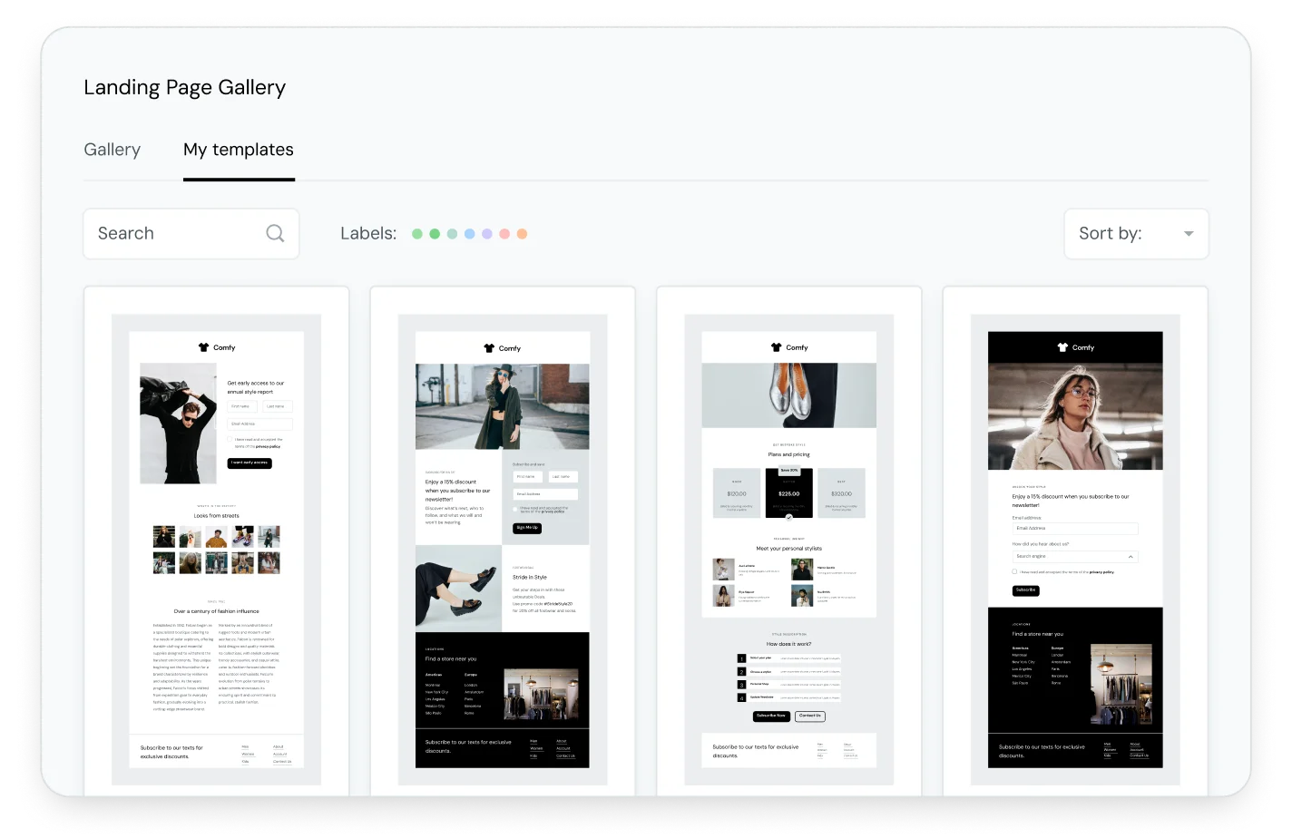
You can browse through Sinch Mailjet’s full landing page template gallery, which allows you to easily add and edit images for a visually appealing experience.
Clear goals provide a roadmap for your landing page strategy. They help define what you want to achieve whether that’s generating leads, making sales, or encouraging people to sign up for a webinar. Without them, it’s nigh-on impossible to design a page that drives users towards a desired action.
Also, without setting a goal, how are you able to measure the landing page’s performance? If you’re new to setting goals, a tried and trusted framework is SMART:
Once you’ve identified your goals and assigned them a metric to measure their success by, you can set up tracking in analytics tools such as Google Analytics. Depending on how/where you’re building your landing pages, you’re likely able to track key KPIs such as form submissions, downloads or purchases directly within your landing page builder. These KPIs will then indicate what elements of your landing pages need adjusting.
If you’ve been carefully monitoring your bounce rate between ads, emails, and landing pages and noticed an abnormally high number between the three, it’s possible there’s a mismatch between message and design.
Now, subscribers and visitors expect a seamless, smooth, and hassle-free experience across all channels when communicating with your brand. So, if the messaging and design of your email doesn’t match what’s displayed when they arrive to your landing page, they’re going to think something is off.
Have I arrived at the correct page? Why are the color schemes different to the email? Why has the attractive headline that encouraged me to click through now disappeared from the copy? Hmm, I think I’ll just leave..
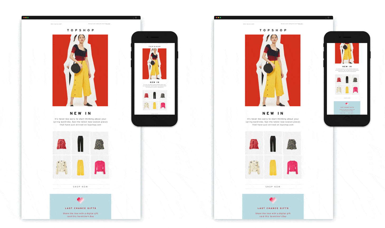
Clearly this is something you want to avoid, and a quick and easy LPO fix is to synchronize these elements and create a cohesive experience for your audience. Take a look at this example from our email marketing webinar series:
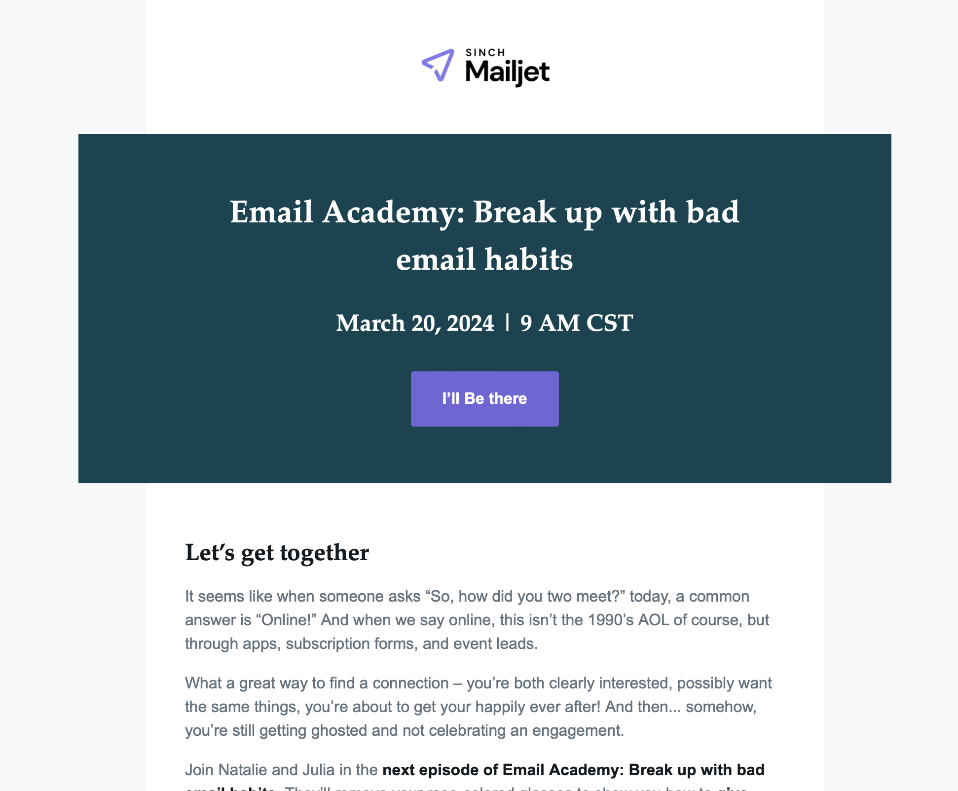
This is an email our subscribers receive informing them of an upcoming episode of our Email Academy webinar series.
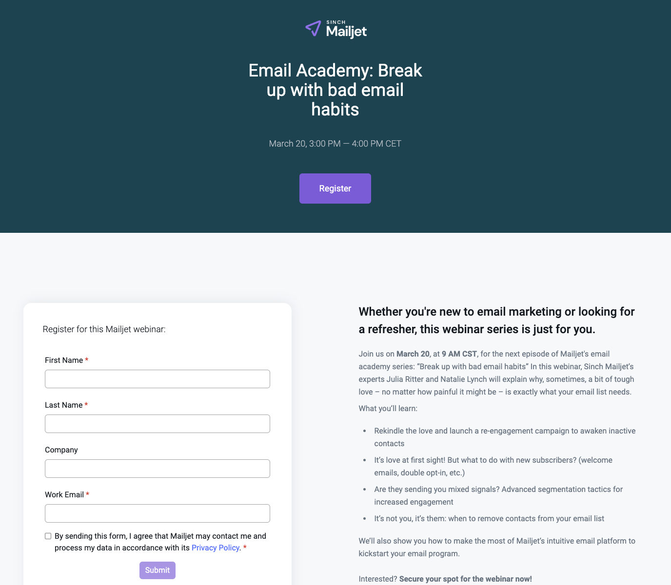
Notice how the landing page is targeted specifically to the webinar, and is synchronized both from a content, design, and structural perspective.
You’ve probably heard the expression we only get one chance to make a good first impression. But did you know how long that chance actually lasts for? According to experts, we’ve got about 7 seconds to make a great first impression. So, we’d better get it right.
Now, the design of your landing page is one of the first things visitors notice. And a clean, modern, and visually appealing design can instantly capture a reader’s attention. This includes the use of high-quality images, consistent branding, and a layout that is easy to navigate. According to a study by Adobe, 38% of people will leave a website if the content or layout is unattractive.
Also, a fast-loading page is crucial. Visitors can be impatient and if your page takes too long to load, they will likely leave. So, remember to use a responsive design so that your landing page looks great and functions well on all devices, especially mobile.
Don’t forget that each landing page should have a single goal in mind, period. No more, no less. So, if you land on the page and can’t immediately determine what that goal is (in 7 seconds) then it needs optimizing. People just aren’t going to dawdle about trying to figure it out for themselves.
With that in mind, your headline and primary message should be clear and compelling, addressing a pain point or highlighting a benefit to immediately engage the visitor. Ask yourselves, after quickly scanning is it clear what the UVP is?
As an extension to this point, is there an eye-catching CTA button with contrasting colors and a clear message? Once you’ve got a visitor’s attention you need to make it crystal clear to them what the next steps are – what is that you want them to do. Again, if you don’t, they’ll skedaddle right off the page.
Now here’s an area you’d perhaps not considered when thinking about LPO. Now, seeing as landing pages are built for conversions, the focus tends to be (and rightly so) towards design, layout, and CTAs. Search engine optimization (SEO) is an afterthought.
However, there’s a ton of value of to be had by lending your SEO cap towards your landing pages. For example, while landing pages are often designed for targeted campaigns, SEO can help them attract organic traffic. People searching for relevant terms might land on your page, expanding your reach beyond the initial campaign.
Also, by digging deeper with your keyword research you can really hone in on search intent. This ensures that people who find your page are genuinely interested in what you offer, leading to better conversions.
Let’s face it, landing pages can be subjective. If you’ve spent a lot of time fine-tuning the copy, coordinating with design, selecting different media elements, case studies, and customer testimonials, it can be hard to step back and take an objective look. I mean, nobody likes to hear their baby is ugly, right?
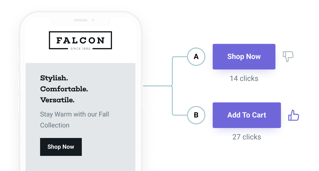
A/B testing is great as it replaces this guesswork with hard data. It allows you to compare different variants of your page (headline changes, button colors, etc.) and see which one resonates more with your target audience, ultimately increasing conversions.
Here are some actions you should take and processes involved in A/B testing:
So, are you ready to start building and optimizing landing pages as part of your larger marketing strategy?
Mailjet now offers a drag-and-drop landing page builder built directly within our email marketing platform. With our new tool, you will have access to pre-built templates that are easily optimized to closely align with your email marketing campaigns. You can seamlessly integrate forms – including custom fields – to collect valuable visitor data as well as sync leads with email lists, allowing for targeted follow-ups and nurturing.