Marketing
14 types of landing pages: Matching method to marketing goals
Marketing

Landing pages are the unsung heroes of email marketing. They’re the gateways to your offers, the first impression you make on your audience, and the key to converting visitors into leads or customers. But not all landing pages are created equal.
In fact, there’s a wide variety of different landing page types, each with its own purpose, design, and best practices. We’ll explore 14 of them and show you how and when to use them, helping you choose the right landing page for your email marketing campaigns.
A lead capture landing page is a dedicated web page readers are sent to after clicking on a specific link. The primary goal of a lead capture page is – as you’d expect from the title – to convert potential customers into leads.
This is typically done by exchanging something of value such as an eBook, webinar, or a new 2024 email engagement report for a potential customer’s email address. The idea is that once they’ve opted into your email list, they can gently be nurtured with valuable content and relevant resources until they are ready to purchase.
So, as an email sender lead capture pages are going to be your bread and butter and form a core part of your overall email marketing strategy.
This minimalist page aims to capture visitor information, typically an email address, in exchange for a valuable offer such as an eBook, webinar, or discount. They tend to be concise, with a clear headline, benefit-driven copy, and prominent call-to-action (CTA).
But wait, this sounds familiar, right? isn’t that the same as a lead capture landing page?
Almost, but there are subtle differences between the two. Squeeze pages are more transaction-driven and worry less about educating visitors. For example, a lead capture page may include additional information about an offer, such as benefits, features, or testimonials to persuade visitors to submit their information.
A squeeze page on the other hand is likely more minimalist in design, with a single email sign-up form. A no-nonsense John Smith’s approach to landing pages.
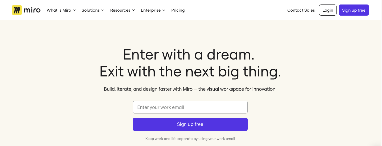
A splash page is like the welcome mat to your website – catchy, attention-grabbing, and sets the scene for what’s to come. Now, unlike a lead capture page, splash pages are not focused on conversions. Yes, they have a goal, but it’s normally to direct visitors to take a specific action by clicking a CTA.
For example, before landing on an age-gated website to verify the visitor’s age before allowing them to enter (e.g., alcohol sales) or providing visitors a choice of different languages.
It’s important to note that while splash pages can be beneficial, using them excessively can hinder a visitor’s experience. They should be designed with a clear purpose, load quickly, and provide a straightforward way to access the main website content.

As an email marketer you know that before poking visitors in the eye with your product and demanding they “Buy Now” you must demonstrate its value. Why should they care about your product? How does it benefit them? What pain points does it solve?
This is where a click-through landing page comes in handy. It bridges the gap between email content and conversion by providing that additional information to potential customers.
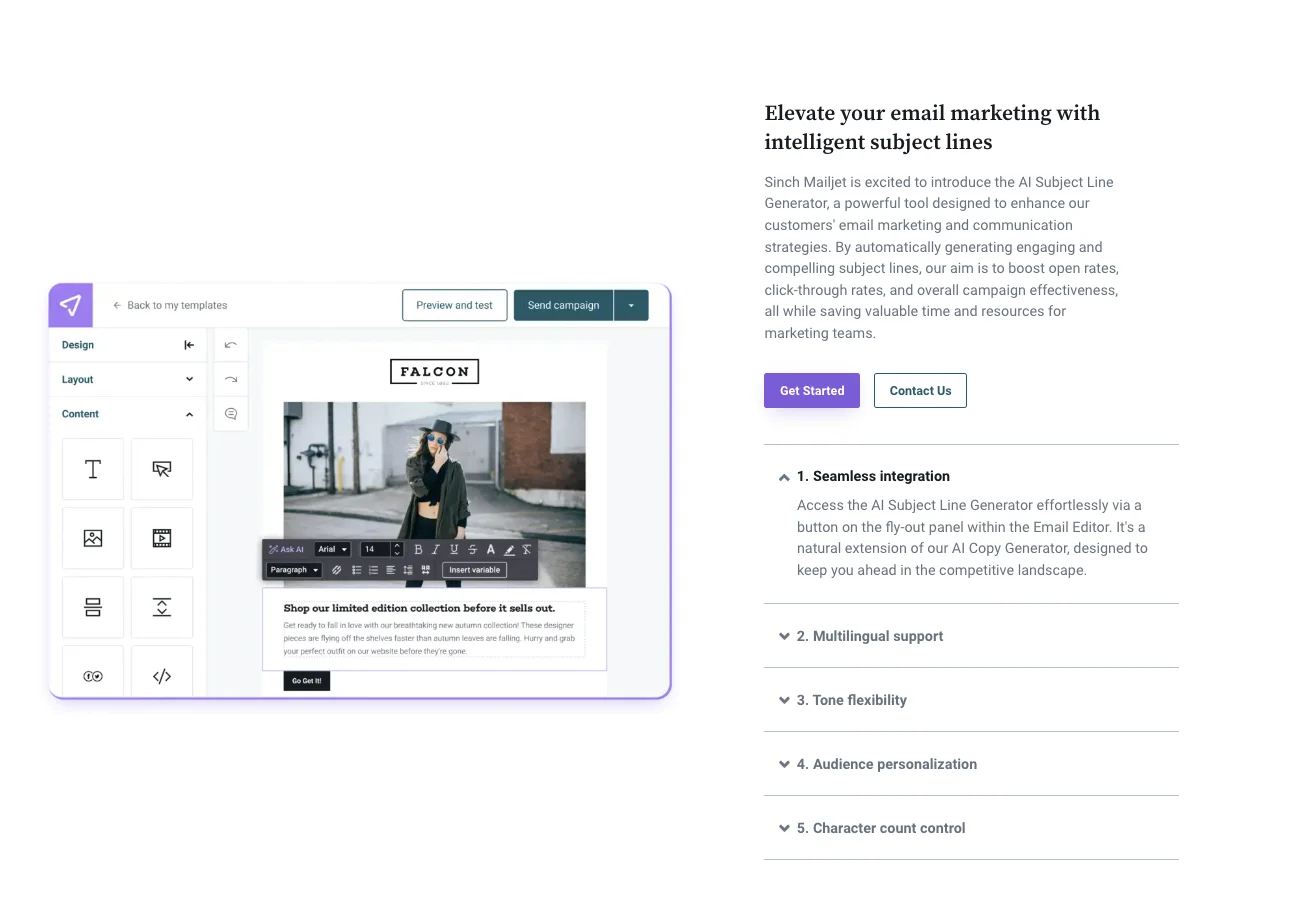
Take our new AI Copy Generator landing page as an example. Before being asked to take action visitors are shown how the tool works, the benefits of AI email marketing, and why you should care. So, by the time a visitor clicks the “Get Started” CTA they’re prepped and ready to do.
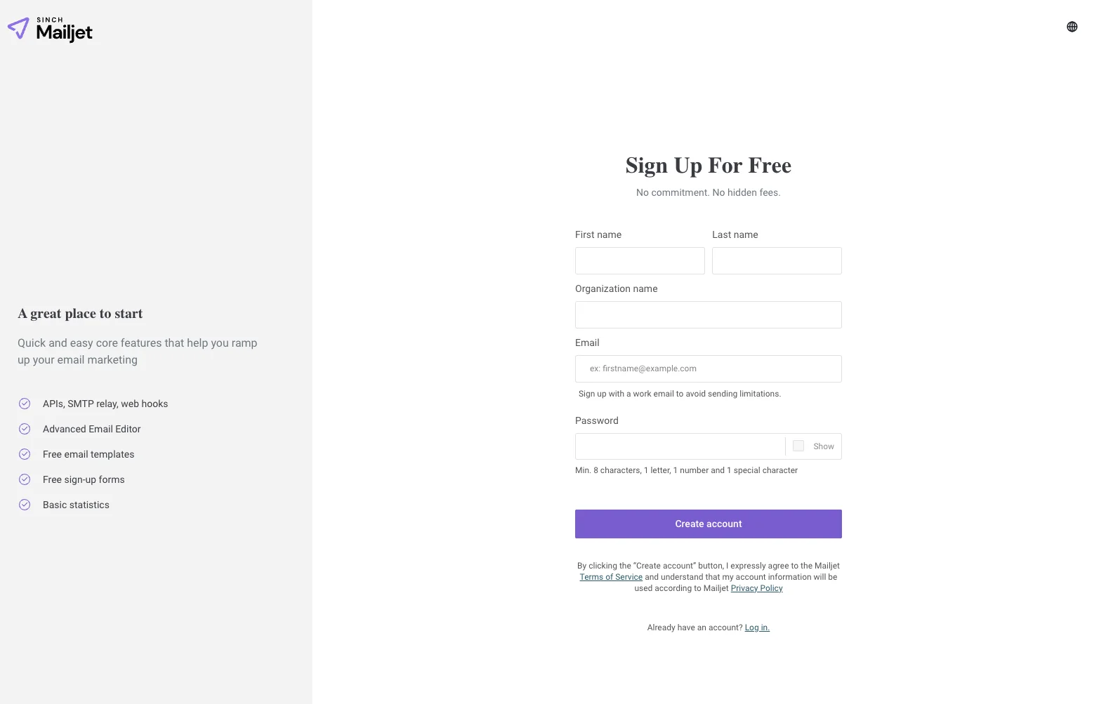
So, a visitor has liked what they’ve read on your click-through landing page and are interested in your product or service, what do they do now? This is a good time to direct them to a “Get Started” landing page.
The content here should be driven through a clear and strong call CTA, such as “Sign Up Now,” “Start Your Free Trial,” or “Create Account.” The CTA is typically prominent and easy to find, leaving no room for confusion about what the visitor should do next.
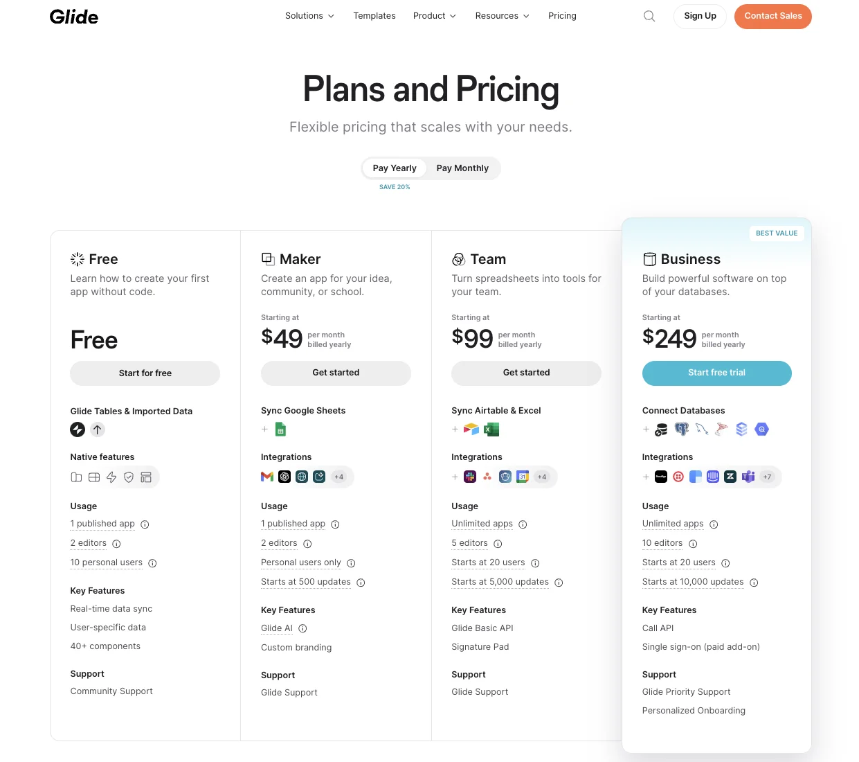
In some instances, you might want to direct visitors straight to your pricing page. Depending on the product, previous click-through landing page content, and your own onboarding process, a pricing plan page might make more sense.
Your pricing plan page should start with a compelling headline that highlights the value proposition of your product or service. Then, present your pricing structure in an easy-to-understand format. This typically involves a table with clear pricing tiers, with each tier outlining the features and benefits included.
The goal is to make it easy for visitors to compare plans and identify the one that best suits their needs. Don’t overload them with information but instead focus on the key features that differentiate each tier. By presenting your pricing structure transparently and highlighting the value delivered, you can effectively convert interested visitors into paying customers.
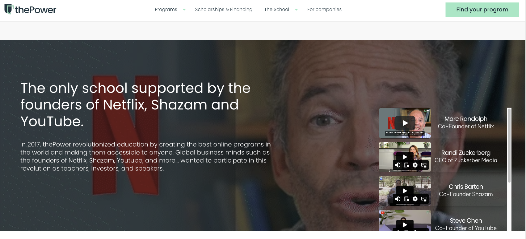
Sometimes persistence is key in getting visitors to act. You’ve probably been in a similar situation yourself. A friend or colleague perhaps asking you to hang out after work and stay for a couple of drinks. Initially you decline, thinking an early night and the latest Netflix documentary more appealing. However, your colleague’s afternoon of persistence finally convinces you an afterwork drink perhaps isn’t so bad after all.
A long-form sales landing page is a little like your persistent friend or colleague.
Typically, it will contain various customer testimonials, answers to all customer pain points, detailed product descriptions, etc. There’s no real thing as too much information when it comes to long-form sales landing pages.
This clearly won’t form the core of your email marketing campaign. Nonetheless, an “unsubscribe” landing page is important not only for compliance with email marketing regulations but also for providing good overall customer experience.
It might be worth including an optional feedback form where people can share their reasons for unsubscribing. This can offer valuable insights for improving your future email campaigns and addressing any issues or concerns. Some of the concerns raised here could be affecting other subscribers on your email list.
Also, it’s a nice touch to leave a Thank You message once people unsubscribe. Express gratitude for their past engagement with your brand and it can help leave things on a positive note – a kind of fond farewell.
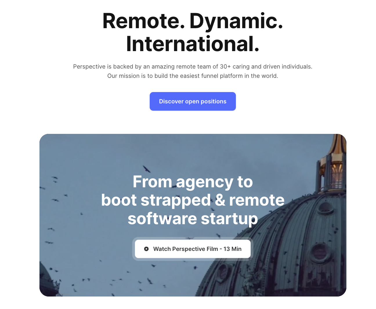
An “About Us” page is your chance to connect with visitors on a personal level and build trust. It should tell the story of your brand, from its origins and motivations to its goals and aspirations. Sharing your unique journey helps potential customers understand who you are and connect on a deeper level.
Again, while you won’t be building your email marketing campaign around an “About Us” page, you can still use this space to highlight what sets you apart. This could be your company values, your commitment to quality, or the expertise of your team. By showcasing what makes you special, you give visitors a reason to choose you over the competition.
Releasing a new product but not quite ready go live for paying customers? No problem, you can still create buzz around the release with a “Coming Soon” landing page.
A “Coming Soon” landing page typically offers a way for visitors to stay informed by through an email opt-in form where they can sign up to receive updates, notifications, or exclusive offers related to the upcoming release.
For example, to promote our new landing page feature (to be released in the coming weeks) we give visitors the option to sign-up to a mail list where they’ll be immediately informed when the product goes live:
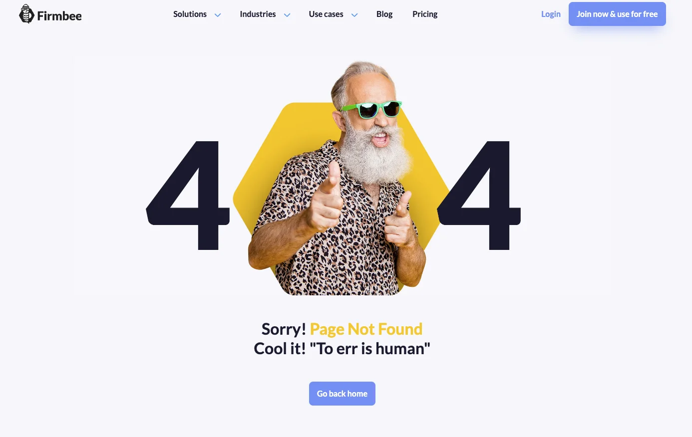
A 404 page is your website's friendly way of saying, "Oops, we couldn't find what you were looking for!" While it's a page that nobody wants to land on, it's essential to make the experience as pleasant and helpful as possible.
First and foremost, the 404 page should clearly communicate that the requested page couldn't be found. This can be done through a friendly message or a playful image, maintaining the tone of your website while acknowledging the mishap.
Additionally, it's crucial to provide navigation options or links back to the homepage or other relevant pages. This helps users easily find their way back to where they came from or explore other parts of your website, preventing frustration and keeping them engaged.
Most company websites have a dedicated product section where visitors can explore the various offerings a brand has to offer. However, if you’re looking to run a specific email marketing campaign around a single product, you might want to create a dedicated product landing page.
This page serves as the digital storefront for a specific offering, whether it's a physical product, software, service. To effectively engage potential customers and encourage conversions, these pages should provide comprehensive information about the product. This includes clear and enticing product descriptions that highlight its features, benefits, and unique selling points.
Additionally, product pages should include high-quality visuals, such as images or videos, to give visitors a clear sense of what the product looks like and how it functions in action.
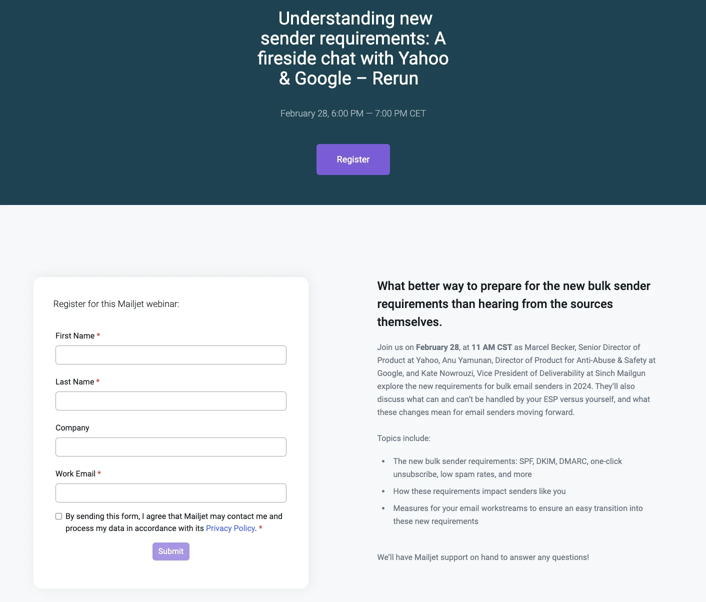
Whether you’re hosting a webinar series, speaking at a conference, or organizing an in-person meet-up, you’re going to need to let people know about it (and give them the option to attend). This is where an event registration landing page comes in handy.
Think of it as the event’s digital flyer. It's where visitors can find out more information such as the what, where, and why. What is it about? Where’s it being held? Why should I attend?
You should start with a catchy headline that grabs a visitor’s attention and clearly states the event's name and purpose. Follow it up with a brief description of what attendees can expect, highlighting the value and benefits of participating. Include essential details such as the date, time, and location of the event, as well as any special features or speakers to build anticipation and excitement.
A good "Thank You" landing page isn't just about saying thanks (although that's clearly important too). It's also a prime opportunity to keep your new lead engaged.
First, you want to clearly confirm what action they just took. Did they download an eBook? Sign up for a newsletter? Let them know you got their information and where to find what they signed up for.
This builds trust and assures them everything went smoothly. You can then capitalize on their interest by offering them something else of value. Maybe it's a related blog post, a special discount code, or an invitation to follow you on social media. This keeps the momentum going and encourages them to explore what you have to offer.
Now that you have seen some of the use cases for landing pages, the next question is how can you integrate them into your current email marketing strategy?
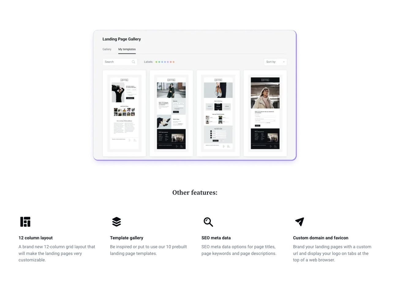
To simplify this process, Mailjet now offers a drag-and-drop landing page builder built directly within our email marketing platform.
With our new tool, you will have access to pre-built templates that are easily optimized to closely align with your email marketing campaigns. You can seamlessly integrate forms – including custom fields – to collect valuable visitor data as well as sync leads with email lists, allowing for targeted follow-ups and nurturing.