Email best practices
Designing the perfect newsletter for marketing
Newsletters are not one-size-fits-all. There is a different design to suit every audience and content you are communicating. We’ll run through newsletter strategies and examples to help hit a perfect home-run when you hit send.

PUBLISHED ON
Sometimes a tried-and-true method can be more successful than an innovative one, and this principle applies to newsletter marketing.
Working in ecommerce and digital marketing means consistently creating email campaigns and email newsletter design – and considering when to use newsletters over social media marketing on Facebook or Twitter. While social media marketing can feel fresh, trendy, and inventive, newsletter marketing can still effectively convert new customers more than Facebook and Twitter ads combined.
Despite social media’s perceived relevance in today’s marketing climate, newsletter marketing is nothing to scoff at. And you know what will make your life easier and save time with your newsletter marketing efforts? Creating email newsletter templates. So let’s explore how to design reliable and tested newsletters to land in your audience’s inbox and get their attention.
Table of contents
Content is king: Think about content before anything else
First impressions matter: Decide on your subject line and “from name”
Keep it simple: You don’t want to overdo it
Think about your colors: People respond to colors differently
Don’t be pushy: Be modest when it comes to your CTA buttons
Establish your goal
Set specific KPIs
Find the focus of each newsletter
Use attractive email templates
Company newsletter
Nonprofit newsletter
Event newsletter
Holiday newsletter
Monthly newsletter
Forgetting about the mobile experience
Not using a single column template
Implementing poor content formatting
Not segmenting your audience
Netflix
Hodinkee
InVision
The Hustle
Vox
5 main things to consider when designing an email
Content is king: Think about content before anything else
When putting an eye-catching newsletter template together, you should consider content first and foremost. Keep the header and the rest of your content brief and concise, as you only have the reader’s attention for a short time.
Use images on top of your email to capture the reader’s attention, followed by short blocks of text and a clear call-to-action (CTA).
First impressions matter: Decide on your subject line and “from name”
We recently talked about the saying: First impressions really do matter when it comes to the subject line. Only 35% of recipients open emails based on the subject line alone. So first, start thinking about your “from name,” which tells readers who the email is from. This can be creative – you don’t necessarily have to use your company name or your department name. If your email is the vault and the content inside is the treasure, your subject line is the key.
Know your audience, personalize, and A/B test to find the best subject lines for your users that won’t make them want to unsubscribe.
Keep it simple: You don’t want to overdo it
To create the best email newsletter, give it a set structure: one feature area and two smaller columns below. Don’t cram your email with too much information, as it won’t be appealing to the reader. Provide plenty of white space and keep your newsletter neat and straightforward. Try keeping a similar format to your newsletters, as users expect the same look and feel over time (hello, brand consistency!).
To have your email render correctly on various devices, be mindful of your email size. The ideal width is between 500 and 680 pixels. Smart Insight’s handy infographic sums up a range of email design best practices to follow.
Think about your colors: People respond to colors differently
As we discovered in a previous post, different people respond uniquely to different colors. Be mindful of which hues you choose for your images, background color, font, and CTA buttons. After ensuring that you’re keeping true to your brand identity, think about your audience. Using specific colors based on your demographic, you can improve your results and, ultimately, your return-on-investment (ROI).
The more you know your customers, the better you can tailor your emails. To gather information from your existing customers, try running surveys as part of a raffle or competition. You’ll find most users are willing to spend two minutes telling you about themselves for a chance to win something they want.
Don’t be pushy: Be modest when it comes to your CTA buttons
Imagine your CTA button is a sales assistant in a shop. Are you likely to trust one that’s being pushy, asking you to try on a pair of shoes or buy a specific blouse? Or do you trust the informational, subtle, yet suggestive ones? The same principle applies here.
Think about the placement of your CTA. Studies show that CTAs placed at the bottom of the email ramp up higher click rates than on the right or left of the email. Also, make sure it has relevant text. For example, emails sent to a particular demographic may prefer “Purchase Now” to “Buy Now.” Research, test, and compare your campaigns to improve your CTA.
Remember: timing is everything. You don’t want your subscribers to miss your stunning email newsletter design because you sent it at an inopportune time. Find the best time to send your newsletter to your readers for optimal engagement.
Creating an attractive newsletter
Hopefully, we’ve got you warmed up to the idea of designing and creating a newsletter to streamline your marketing pursuits. But where do you start? Don’t worry because we’ve got the steps you should take to make an attractive and practical newsletter for your brand.
Establish your goal
By considering your readers and their pain points, you can arrive at an attractive value proposition that your newsletter will offer. In other words, your newsletter could be the solution to all of their problems, and what could be more appealing than that?
Set specific KPIs
Think about how you will measure your newsletter’s success. Here are a few suggestions for metrics that you can track:
Newsletter subscriptions
Open rates
Click-through rates
Block, spam, and unsubscribe rates
Conversions
Find the focus of each newsletter
You don’t want to overwhelm your readers with too much information. For an optimal newsletter, focus on one or two topics for each week or month (however often you send your newsletters). If you’re not sure what to choose, take a look at the competition and see where they are successful and, more importantly, where they’re falling short. Do what they’re not doing and track your results.
You need to make sure that your newsletter has value behind it. That means crafting a specific brand voice that your audience can rely on for a particular message.
Now you have a better idea of what to include in your newsletter to make it successful, but what kind of newsletter should you send out?
Consider creating a newsletter that covers subjects like:
Customer reviews, stories, and successes
News surrounding your company’s accomplishments
Industry leadership and business news
FAQ and other support content
Recent or popular blog posts
Upcoming events, webinars, or courses
Use attractive email templates
The magic behind using certain design elements and templates is you can create customizable packaging for your email messages that align with your brand voice. Plus, you can bookmark templates to save time and maintain consistency across all your email newsletters.
The Mailjet blog offers some awesome content on maximizing the results of your digital marketing campaign with email templates.
For the busiest shopping period in Q4, check out these 14 responsive email templates for your holiday campaigns.
Different types of newsletters
One newsletter template does not fit all. What your audience wants to see in their inbox varies greatly across brands and organizations. Here are some different templates to consider when designing your newsletter.
Company newsletter
This is the perfect newsletter to send when you want to officially address anyone related to your business operations. Whether that means your clients, investors, or staff, this kind of newsletter could be just the ticket to spread the good news, showcase what’s happening internally, announce new products, or address your company’s response to a significant world event.

Find this template in Mailjet’s template gallery.
Nonprofit newsletter
These newsletters can be just what you need to engage with your investors and donors. They help describe what you accomplished thanks to their funding or what you plan to achieve if you’re requesting more support. This type of content can be the perfect medium to share compelling stories and images about the communities or causes your nonprofit is involved in.

Event newsletter
There are so many reasons your business might be organizing an event, and event newsletters are your way to spread the word. In the 2020s, we’ve become accustomed to virtual events, but hybrid models are gaining popularity, and in-person events are making a comeback. Keep your messaging organized to strategically send out newsletter reminders to increase attendance and engagement.
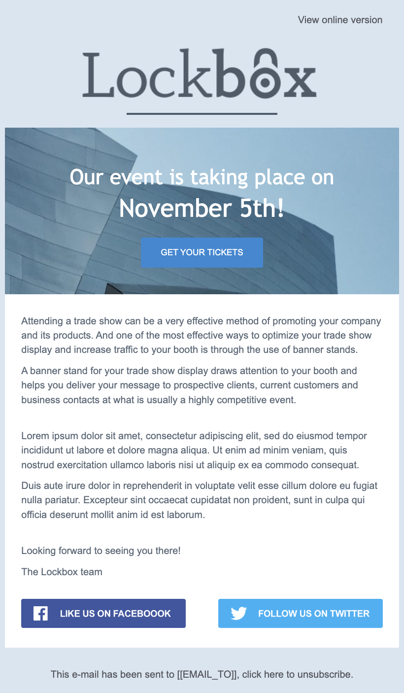
Find this template in Mailjet’s template gallery.
Holiday newsletter
The holiday season is the best time to reach out to customers with spooky Halloween surprises, well wishes, and heartwarming stories from your company. Holiday newsletters can also include special offers and deals or content recommendations to start the year off right.
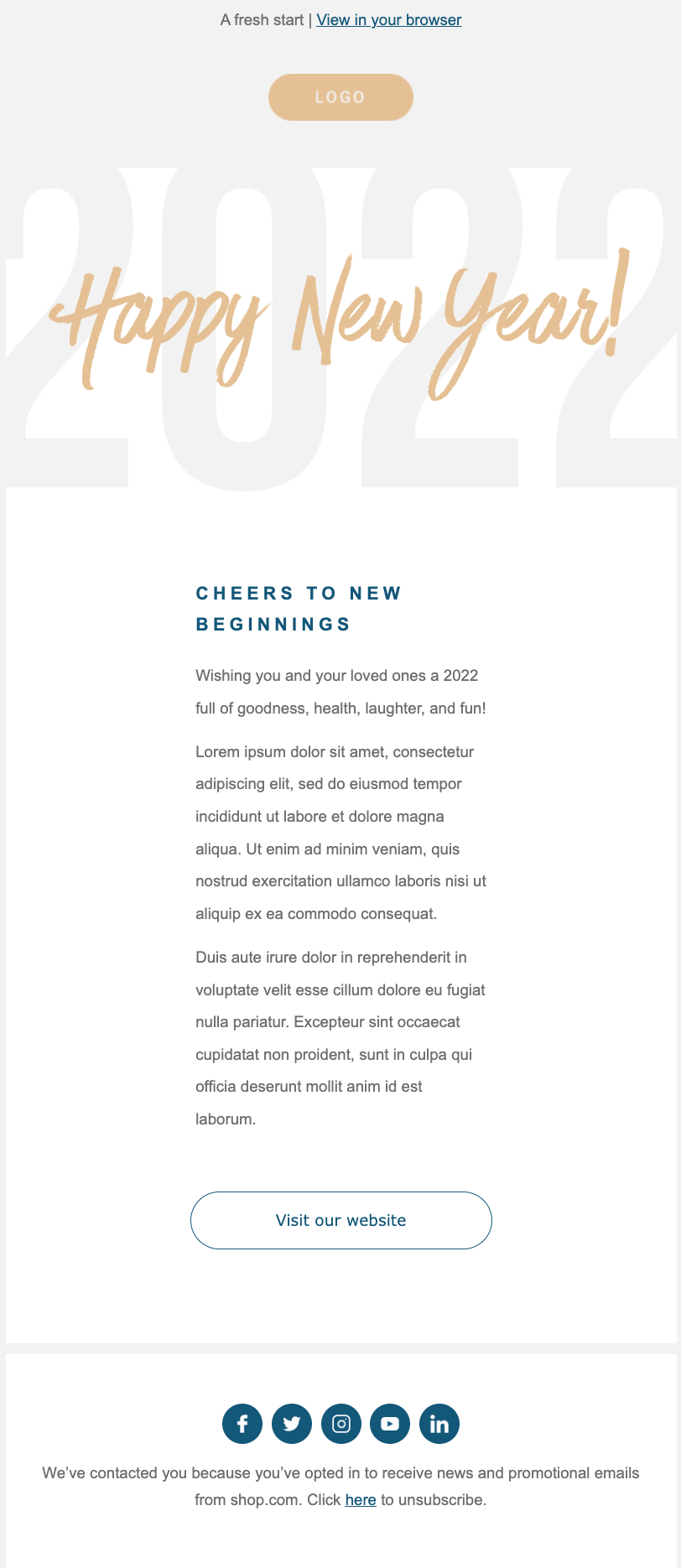
Find this template in Mailjet’s template gallery.
Monthly newsletter
This is a simple method to update consumers about everything from your most recent blog post to highlighting customer reviews and endorsements. Talk about the perfect way to humble-brag.
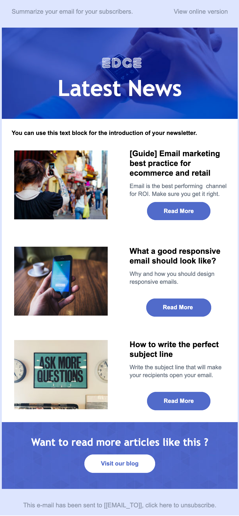
Find this template in Mailjet’s template gallery.
You can accomplish specific goals in the lifecycle of your business with newsletters. Maintaining a consistent email newsletter schedule keeps your brand top-of-mind when a consumer is ready to take action, like sign up or make a purchase. A monthly newsletter sits in the sweet spot of showing up too much and not enough.
4 mistakes to avoid when designing an email marketing newsletter
When it comes to designing your best marketing email newsletter, a few missteps could prevent your newsletter from succeeding.
Forgetting about the mobile experience
Over half of all emails are read on a mobile device. However, there are still so many email marketers who design their email templates for desktop. Ensuring a consistent look and feel across all screen sizes will help your messaging feel premium, organized, and trustworthy.
Not using a single column template
Stick to a single-column style so your content is easy to read on a standard mobile phone. Also, you’ll want to design your email newsletter by leading with the most essential information. People spend an average of 10 seconds reading branded emails, so yours needs to be legible and compelling enough to hold your audience’s attention right from the start.
Implementing poor content formatting
An email recipient can be critical and skeptical of everything that enters their inbox. As such, you’ll want to consider readers who are only going to quickly scan your email rather than read your entire newsletter thoroughly. To anticipate this, write your content using short, digestible sentences, and avoid lengthy paragraphs.
Not segmenting your audience
Think about it: Different people have different tastes, and it’s rare for content to be universally beloved.
Consider segmenting your email clients by gender, location, age, product preferences, interests, lifestyle, past purchases, average spending, or purchase frequency. You can also combine these elements to target specific groups, like women who buy motorcycles every month.
Using an email marketing strategy like surveys, you can encourage your audience to self-identify. After they do, you will have more data to create engaging email content that better serves them or targets their interests.
Get inspired by these newsletter designs
Before we go, let’s go over some examples of newsletters that are doing things right.
Netflix
For us, this email design ticks all the boxes. It uses personalization in the subject line to get the reader to open it and uses a catchy image on top of the email to get the reader hooked. The content is presumably based on this user’s most recently watched shows on Netflix and follows the same color scheme as the Netflix dashboard. Finally, it has practical and not too pushy CTA buttons.

Hodinkee
Hodinkee is the premier destination for all things wristwatches. The single-column design looks clean across all devices, and each headline is short and sweet while avoiding overcomplicated jargon.

There is a wonderful juxtaposition among the imagery that you can see between those high-quality macro shots and the pop art vibe of the digital cartoon images. It’s clear that Hodinkee has done their homework, and their newsletter feels like they’re holding the door open to step inside their world.
InVision
InVision’s newsletter puts forth their greatest hits from the week: stellar blog content and links, designs they enjoyed, and promotional opportunities.

Their newsletter is an excellent example of incorporating multiple dynamic components into your email marketing campaign. We can’t help but salute the clever copy they write on their CTA buttons and the wide variety of headlines that definitely holds attention.
The Hustle
In a world supersaturated with business and tech newsletters, it’s no wonder that The Hustle reigns supreme. They succeed because they’ve invested heavily into crafting their brand voice, which is the perfect intersection between fun and trustworthy.

The Hustle’s newsletter stands out because they’ve mastered audience segmentation. By allowing subscribers to customize their interests, the team at The Hustle can cater their content to what those consumer groups care about.
Vox
Readers can look forward to receiving this newsletter every evening, and they subscribe so they can experience the top stories from the day. Vox balances light content from across the internet with top world news, and audiences can always find something to pique their interest. They also make it easy to read the whole story on their website through the hyperlinks they put in their content.

Wrapping up
In today’s digital marketing climate, designing the perfect email newsletter is a well-rewarded practice. We’ve given you the tools, suggestions, and examples you need to help you get started. If you’re looking for more, check out our step-by-step guide on How To Create An Email Newsletter.
Head to Mailjet to see how our platform and templates can help create marketing newsletters that will wow your readers.
Perfect free email newsletter platform
What’s better than a newsletter to keep your brand on top of people’s minds? Rest assured, Mailjet provides a completely free newsletter platform covering every step of the process, from beautiful ready-to-use email templates, a drag-and-drop newsletter design editor, flawless sending and analysis, right through to SMTP relay, and dedicated IP addresses.
