Get on the road to the inbox: Explore our new email deliverability report
Design The Way You Want
Easy-to-use email editor for any skill set
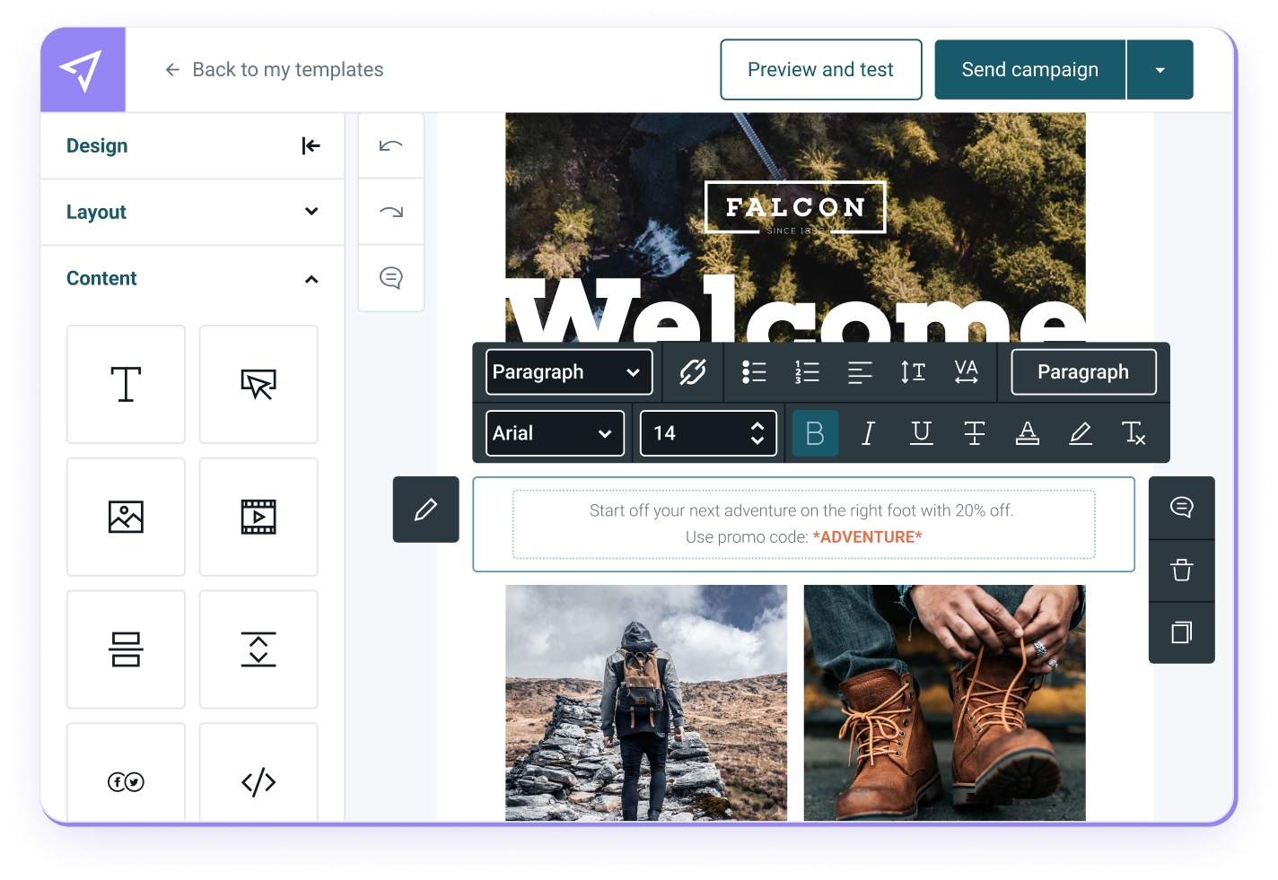
Design responsive emails, forms, and landing pages in minutes with Mailjet. Choose your starting point – a blank canvas, a variety of pre-designed templates, or innovate your email with AI.
Simple enough for beginners but advanced enough for the pros on your team!
Add your brand content, design values, images, links, and videos with Mailjet’s flexible drag-and-drop Email Editor.
Feel confident to hit send– Mailjet templates are optimized across all email clients and screens.


Build Emails Together
Streamline your email needs and collaborate
Reduce time spent on email campaign creation, execution, and management through a seamless consistent experience that will have you sending out emails faster.
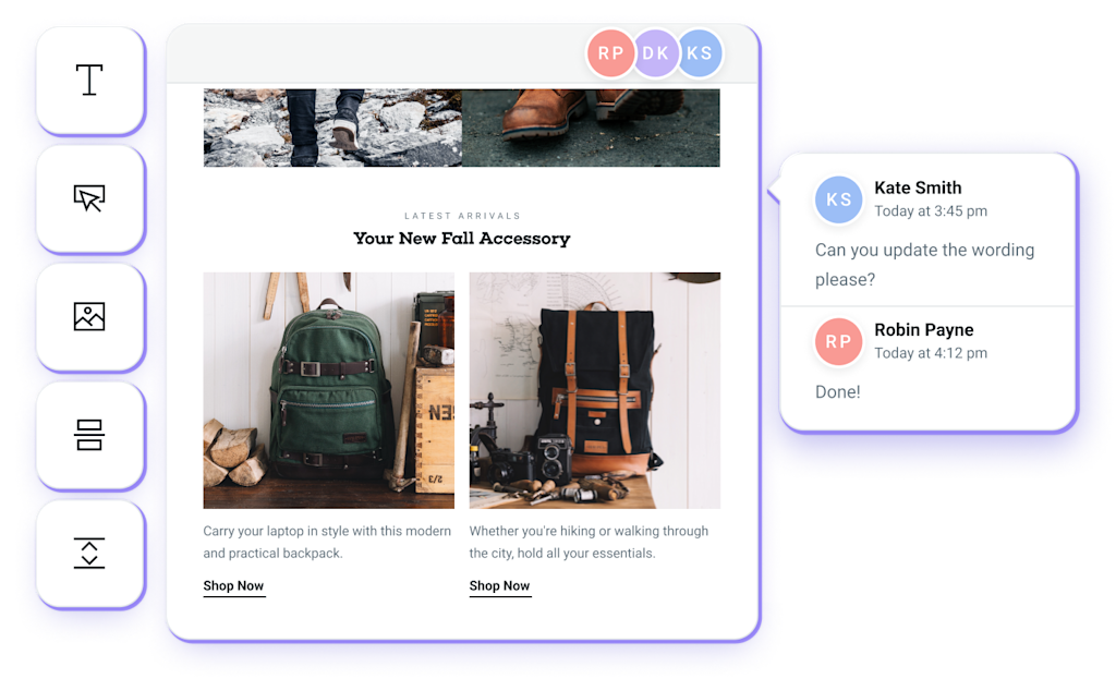
Create emails with your team directly in Mailjet’s Email Editor with robust collaboration tools.
Start with one user and add/collaborate with your team as needed.
Set your permissions and lock specific actions on your templates so your brand assets are protected.
Design Like A Pro
Templates that make you stand out
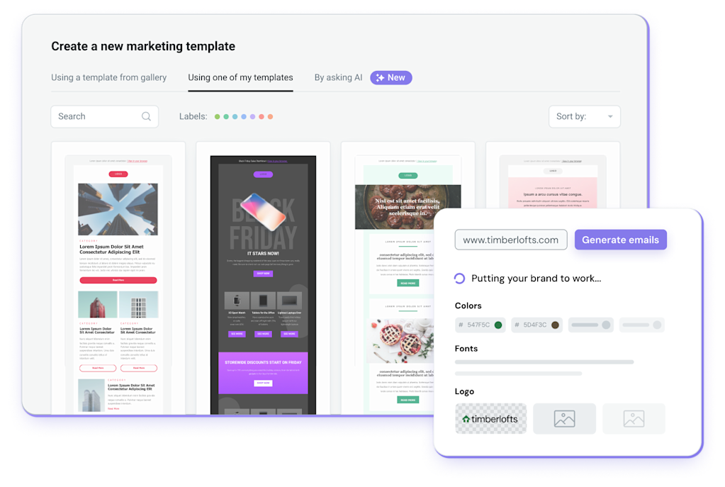
Get started with one of Mailjet’s professionally designed email templates.
Take-advantage of our template library filled with thousands of already built emails and forms.
Easily adapt your templates to reflect your brand's identity in a single click with Brand Kit.

Personalized And Targeted Emails
Professional marketing features for your most effective communications
Personalization
Drive personalized and targeted communications. Use Dynamic Sections to send a single campaign that displays different messages depending on who opens it.
Segmentation
Group subscribers with similar interests and behaviors to send customized and personalized messages. Collect deeper insights with each send.
Automation
Engage your audience at the right moment with the right message – from onboarding to re-engagement, with Mailjet’s drag-and-drop automation builder. Automate key touchpoints, save time, and optimize campaigns in real time – no technical skills required.
A/B Testing
Send your most effective emails by running tests on things like sender name, subject line, or visual content. Test up to 10 versions and see what lands best.
Contact Management
Manage your email lists seamlessly, modify individual contact properties for personalized campaigns, and easily create subscription widgets for GDPR compliance.
Email validations
Increase open rates, avoid the spam folder, and in turn, increase revenue by ensuring that email addresses on your list are real and valid before pressing send.
Get In Their Inbox
Expert approved deliverability tools
Beautiful emails only mean something if your customers actually get them. Manage your sending reputation and avoid the spam folder with Mailjet’s deliverability features.
Integrate with our API in minutes and start sending.
Use email validations to feel confident that you’re sending emails to real recipients.
Preview your messages with our Email Preview tool, to make sure your emails will appear perfectly in their inbox.


Actionable Insights
Precise deliverability and engagement stats in real-time
Track, monitor, and analyze your email deliverability performance and customer engagement in real time.
Filter out non-human interactions from your analytics to get a more accurate overview and make better, more strategic decisions.
Make data-driven decisions about your email campaign strategy with Mailjet’s Statistics Dashboard.
Use Mailjet’s Click Maps feature and our Campaign Comparison tool to gain a deeper understanding about your customers.
Seamless Connectivity
Third-party Integrations made easy
Instantly connect with the rest of your tech stack.
Choose from a curated and extensive list of third-party integrations that work seamlessly with Mailjet.
From CRM and CMS to marketing and ecommerce platforms, you can fully customize your email program to fit your brand’s unique needs.

Boost your email performance with generative AI
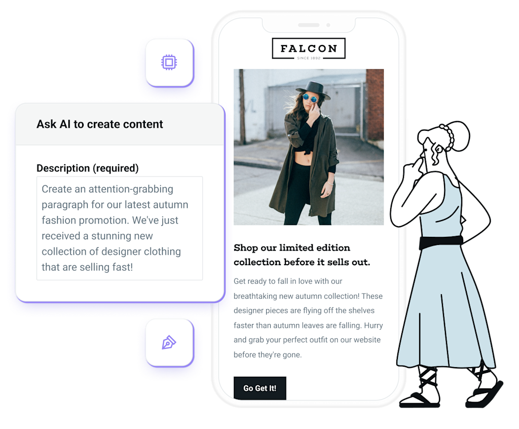
Email Template Generator and Mailjet Assistant are powerful tools designed to enhance our customers' email marketing. You can automatically generate pre-branded templates and tailor subject lines and copy to boost open rates, click-through rates, and overall campaign effectiveness. All while saving valuable time and resources for marketing teams.
1. Seamless integration
Access the Email Template Generator through the Marketing Template Gallery and Campaign Workflow - simply provide campaign details, and AI will craft a professional email in seconds. For fine-tuned messaging, use Mailjet Assistant effortlessly via a button on the fly-out panel within the Email Editor. Create compelling emails with ease, all in one place!
2. Multilingual support
The AI Template Generator and Mailjet Assistant support output in 21 languages, ensuring that your campaigns can connect with a diverse audience globally.
3. Tone flexibility
Choose between an informal or formal tone to align the copy with your brand's voice and messaging style.
4. Audience personalization
Provide additional information about your audience to further personalize the generated copy and enhance engagement.
5. Character count control
Tailor the length of copy by indicating your preference, even suggest character count guidelines.


We send about a million emails everyday now. As a result, it's really important to get the newsletter out quickly, and Mailjet has helped us improve both our sending speed and deliverability. The best part about working with Mailjet is that I don't have to think about it, it just works.

Nick Abouzeid
Editorial & Growth


